Initial planning phase, including project goals and initial sketches.
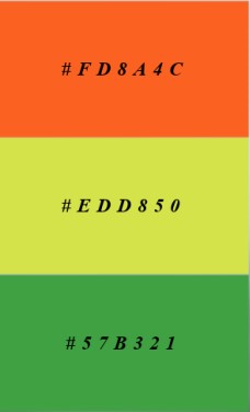
The idea for this project is to raise awareness about what Rooted in Hull stands for while keeping the brand image consistent and relevant for the purpose. This needs to include the use of images which showcase a strong sense of community, public participation, and social interaction. As well as choosing images/colours that represent nature and farming, to immediately make apparent the meaning of the charity. With these goals in mind, the first step in the planning phase was to decide which colours to use. Choosing vibrant colours such as orange, yellow, and green was to give the design a warm and optimistic feel. They are also seen a lot in nature, so they complement the core of the charity, whilst also giving off a welcoming feel to the site. Afterwards, some very basic sketch designs were created for the logo, as well as the layout for the homepage.
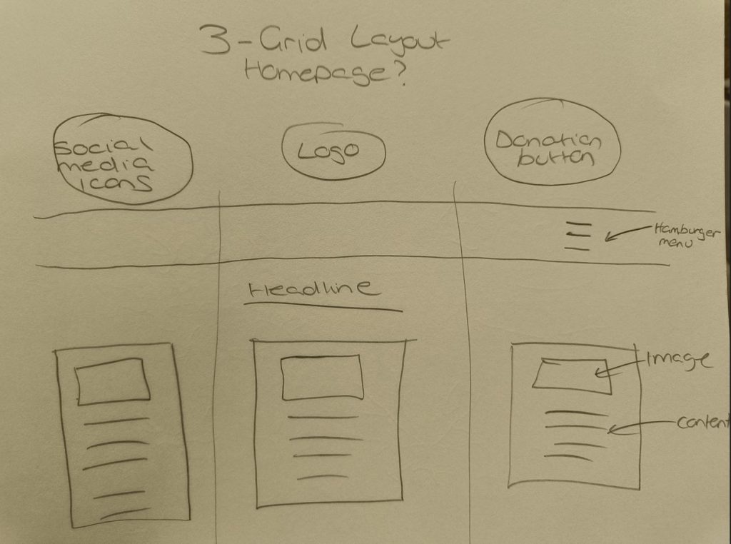
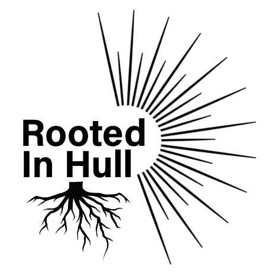
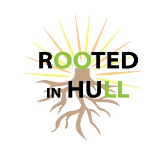
Deciding on a 3-grid layout for the homepage was due to keeping the content as organised as possible, while still delivering a good amount of information, so as to not overwhelm the viewer. In this structure I can also choose the most important section to go in the centre, to guide the viewer’s attention, as this is where the initial focus is placed when utilizing this layout. For the other pages which would focus on a specific subject, such as the ‘social enterprise’ page, I will have a left-to-right layout, in which the text is the first thing you see and then the image next to it on the right. This is the standard layout used in books as people tend to read left-to-right on instinct. While images do command a lot of attention when used, especially at larger sizes, this layout will create more of a balance to the hierarchy on the page, making it more likely for viewers to engage with the text. I am trying to use layouts and design principles to make it easier to control the delivery of content.
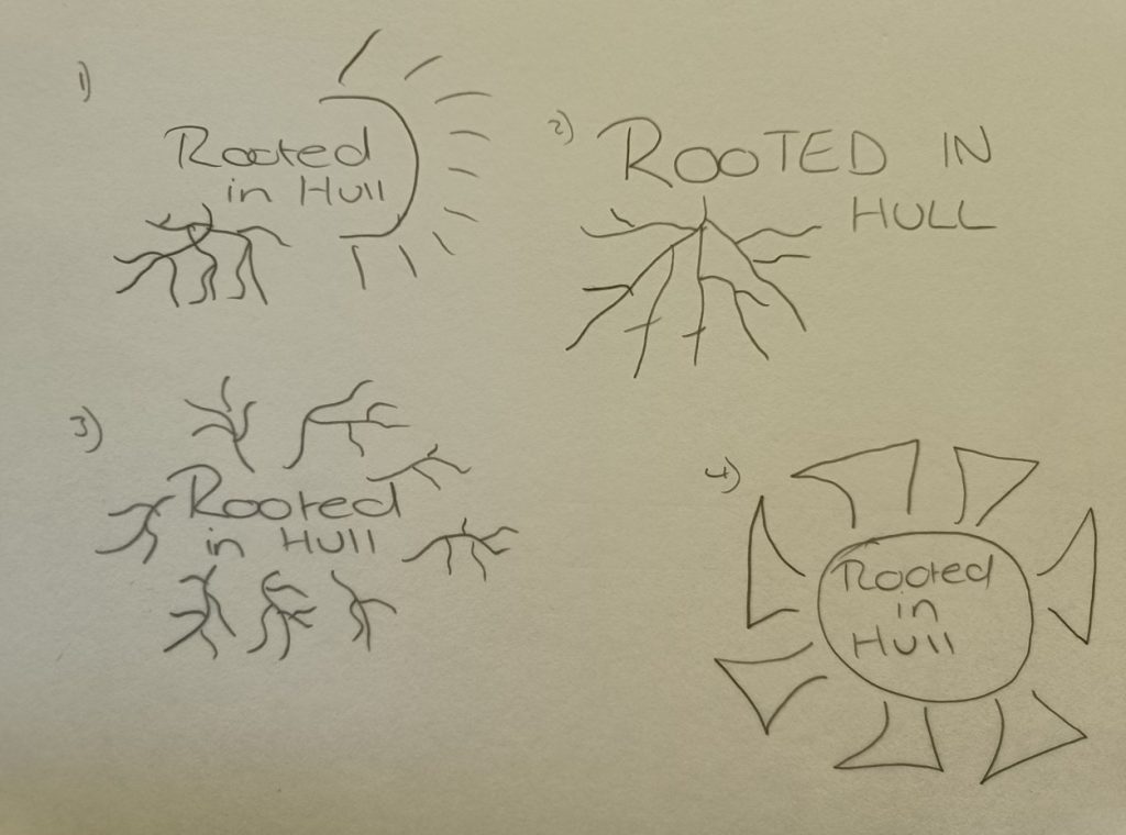
Four very basic sketches were made for the logo with different ideas on how to use the ‘rooted’ aspect. I took quite a literal interpretation for most of my designs, as I felt it created a strong visual identity and fits the theme of the charity perfectly. Playing around with the positioning and size, to see how this complemented the typography for the text. After trying different variations of the logo design and receiving feedback from my classmates I decided to take a different direction with the logo than originally planned. The final step was deciding what type of typography would fit with the brand image. As Rooted in Hull is for a variety of different age ranges, the typography would need to be something easily readable.
Regular updates on design iterations, including wireframes and prototypes.
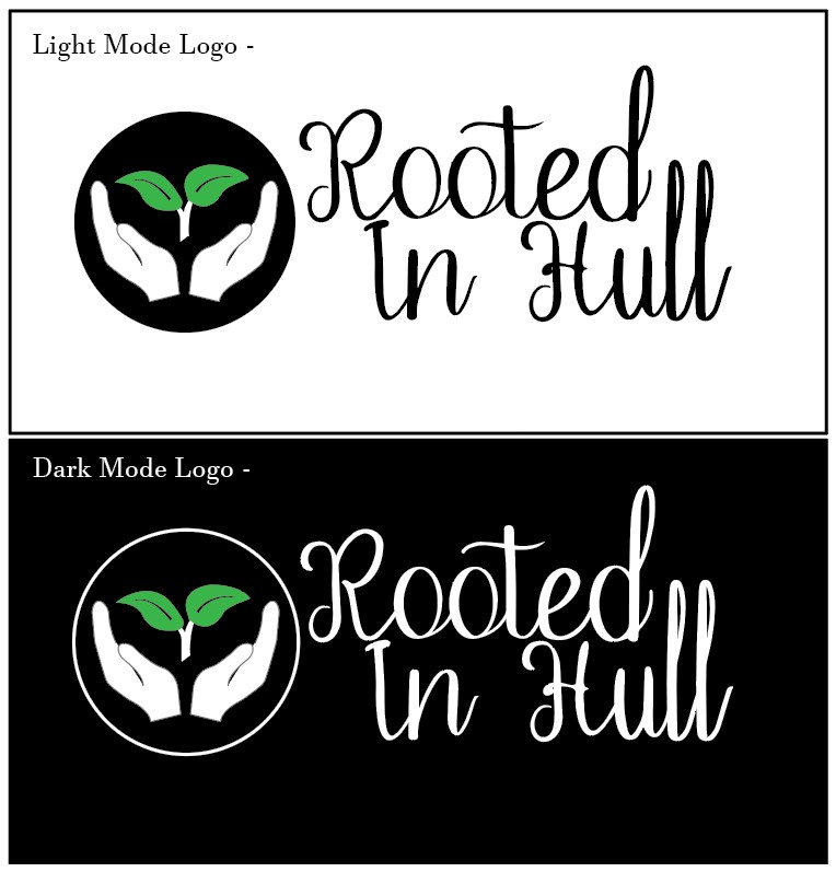
Throughout the design process various changes were made, especially when it came to designing the logo. At first the idea was to have the sun be apparent in the design, so it stayed somewhat familiar to the current design that Rooted in Hull used. After doing different variations using the sun and roots in different ways, I felt that it looked cluttered and would be difficult to see the different elements of the design when it was reduced in size, like when viewing it on a mobile device, or just in the corner of a social media page. So, I wanted a design with a little more simplicity, but also the flexibility to sometimes adapt it slightly, by having the imagery of the logo being slightly disconnected from the text.
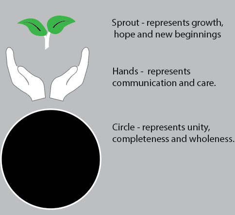
After listening to the feedback from my classmates a different direction was chosen. Looking at the design below you can see how each aspect was chosen to represent the overall theme of the charity. I wanted to include something that visualized the community and growth aspect of what Rooted in Hull stands for, rather than just using the nature component. The hands being open, delicately framing the leaves sprouting out above. This represents the human aspect of the group, being open as in welcoming, and also giving rise to something natural. The sprouting leaves, to show growth, and the hope of new beginnings. Finally, the circle encompassing them represents unity, and the wholeness that comes from working together.
As seen on the first basic layout sketch near the top, a hamburger menu was originally chosen rather than having a visible navigation menu at the top of the page. I thought this would create a cleaner look having less text to distract the viewer. However, this idea was changed after receiving feedback regarding the wasted space this created, and having realised that these links were important enough to have instantly available. The hamburger menu is now only used when using it on a smaller device such as a mobile phone. This is to save on screen space, due to the vastly reduced real estate you have on a mobile screen compared to a monitor or even a tablet. It creates a neater design and is something which has become commonplace on many mobile web pages, so it should be familiar to users, which in turn gives a better user experience.
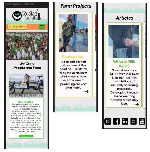
Another change was adding the carousel component for use on mobile devices rather than having the boxes stacked on top of each other, this saves the user having to scroll as much, which would likely deter someone from getting to the lower information. I wanted to make it conspicuous that it was swipe-able, by having the edge of the next headline box be visible at the side of the screen. I may also add an indicator beneath the boxes, to make it even more apparent that there is more content to swipe to and avoid users glossing over key elements. The donation button was also changed so it floats on the page, this ensures the call-to-action button is always visible and accessible to the user rather than it being fixed at the top of the page. Being a charity, they can only survive on the donations of their users, so whilst this is slightly more intrusive than just leaving it at the top of the page. I don’t believe it is too unethical, like taking over the entire screen as a pop up, rather this is just more of a gentle reminder while they find out more about the charity.
Technical challenges and solutions.
The main technical challenge I faced while doing this project was navigating and creating certain components on Figma. As Figma was recently updated, some buttons have disappeared or have been moved elsewhere, so while watching YouTube videos on how to create a carousel component and following along with the instructions they were mentioning buttons that were not visible on my screen. This made it very difficult to follow the instructions and navigate around the software. I then had to search to find the correct elements needed to create the carousel since some of the symbols had changed and were moved to different locations, this meant looking up where they had been moved to until I was finally able to complete the steps. Once the carousel component was created, I tried to set it up to the vertical scrolling option, but an error message kept appearing saying that the frame did not fit even though I followed the correct steps. This ended up with me having to get in touch with one of my teachers to help me fix the problem by having to resize the frame.
Another challenge was when creating the hamburger menu bar as I have never done this before, and I found most of the instruction videos I watched very confusing due to the technical jargon they used, which I didn’t understand. Some of the videos also seemed to run through the steps too fast for me to follow along while trying to find the correct buttons on Figma. I also struggled with some of the mock-up templates I used, as they had too many layers, which resulted in it being difficult to find the one that needed to be removed and replaced with my writing or images. After using different mock-up templates, I started to understand what to look for better and it became a lot easier with repetition.
Most of the technical challenges I encountered were due to my lack of understanding of the software since I had not used it in a while. With more time focusing on using the different software regularly so I can keep up with any changes that may occur due to updates, this should reduce the problems I would have in the future. It all comes down to repeatedly using it to cement my current knowledge, as well as continuing to do tutorials, in order to learn new techniques and gain a better understanding of the software. Which will enable me to enact my ideas/designs with greater ease.
Feedback received and how it was integrated.
When first creating the design for the logo I originally went in a different direction than the final design. The feedback I received from the first try of this design was that the roots came across looking spooky and almost halloweenish. Reflecting on this, I could understand where they were coming from, as the sharp, strong edges to the roots ended up giving them the look of something like lightning or knives. Which is obviously not the type of imagery I was trying to conjure. I then tried to round the edges and make them have a softer look which improved the design a bit, but then the feedback I was given made me go in a different direction. One of my classmates mentioned trying to have the logo placed next to the writing, rather than underneath it, so the design did not come across as cumbersome. I ended up preferring this design as it had a neater look to it. With the logo on the side, the imagery and text no longer overlap, so the text was no longer washed out slightly, as it had been when contesting with the colours behind it. I felt like this clarity made it more appealing.
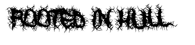
I was also given feedback about trying to use a type of typography that incorporated the roots within the words. I tried looking at fonts which incorporated roots into the letters, which I then sent to the group chat for feedback. The majority of classmates mentioned that it came across cluttered and was difficult to read, which I agreed with. I also felt like the readability would be particularly awful on smaller screens, and just in general it didn’t create the natural, friendly theme I was wanting. Even if I had fully designed the letters myself, trying to make the letters made from the roots, I thought it would run into the same problem, so I ended up scrapping this idea completely.
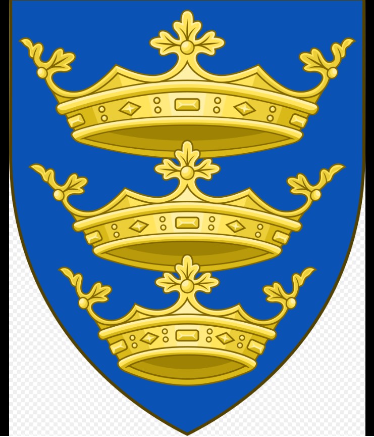
One of my teachers mentioned after seeing one of my first designs, that it did not have anything to signify Hull, and to try incorporating a conceptual design. I then researched this idea and had noticed that a lot of businesses in Hull use the Humber Bridge in their logos, so I decided against this idea as I wanted it to look unique rather than using the same ideas. I discussed with my classmates about the possibility of using the Hull crest in my design, but they mentioned that when the logo was smaller it would be difficult to see the details which I agreed with.
I also received feedback from one of my basic sketches of the main page layout. At first the idea was to have the menu bar placed into a hamburger menu style but when it was pointed out to me that it made the top of the pages look empty, I decided to use a normal navigation menu, in which each option is visible to the user at the top which filled the blank space. I found sharing my work with my classmates extremely helpful, as they thought of ideas and issues that I would have generally not thought of. It can become easy to get tunnel vision on certain designs or ideas when working on them in isolation, and also to get too attached to certain concepts. Bringing in other perspectives really helped to infer how my designs will be interpreted by others, and gave invaluable insight into how I can adapt and improve them.
Specific instances where sustainable and ethical practices were applied.
For reduced energy consumption there will be a dark mode option, this is also useful for users browsing at night time. As a lot of users tend to use their phones in the darkness while laid in bed, being blinded by a high brightness site could be an instantly off putting, and cause users to click away before exploring the site. With energy consumption in mind, having the videos not automatically play when the user loads the page slightly decreases this. From an ethical perspective, I also don’t think it’s right to force users to instantly start watching something without them having purposefully clicked on it. However, this can be okay if the auto-playing video is used purely for the visual interest of the page, rather than to force something on the viewer that could distract or annoy them.
By limiting the JavaScript loaded and used, such as for animation, this can help improve site speed and accessibility, which in turn gives the user a simpler and faster experience when navigating around the website. By blurring some of the backgrounds on images this helps to reduce file size. This can be part of the design as when using text over an image, it may be advantageous to have the background slightly blurred, to give more contrast to the text. It’s also very helpful as you can blur people’s faces so they are not recognizable, which is important as Rooted in Hull deals with some sensitive groups that may not want their face plastered on the internet for safety reasons. Of course, there are general privacy issues, which would involve making sure all those in the images used are consenting to being on our social media, or web page.
The aim of the website is to garner interest in the charity’s goals, but a big part of this does involve the monetary aspect of needing donations. As previously mentioned, I have considered the ethicality of constantly having the donation button be visible on the page, and I believe I am doing this in the most effective yet ethical manner.
Final design presentation with detailed explanations. Low/Mid/High fidelity mock-ups with explanations.
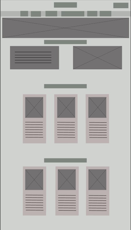
As seen from the low fidelity homepage above, a 3-grid layout is in place. This is to keep the website looking neater, so it is easier to navigate around which results in a better user experience. Moving on to the mid fidelity example below, text and headlines have been incorporated to provide a clear layout of where each element would be placed. A grass boarder has been used to split the content from each other, this is to keep the sections organised and with the green grass colour it will be more visually pleasing.
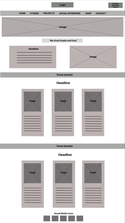
Yellow was chosen for the floating donation button on the top right as it is eye-catching and draws the users immediate attention. The social media icons have been moved to the bottom of the page rather than the top left as seen on the basic design sketches. This was to prevent the area from looking cluttered and draw the user’s eye to the logo and donation button instead. A warm orange colour was chosen for the navigation menu as it is a vibrant and positive colour which works well with what Rooted in Hull stands for. Each subject is evenly spaced, and bold typography is used for easy readability. Underneath is a large photo of flowers which was taken by Rooted in Hull, this was chosen to symbolize growth and nature. The content has been put neatly into each section with the relevant image added, as well as bright colour boarders to attract attention and create a brighter design. Each headline is the same colour as the boarder to create consistency and break up the dark black colour used in the text.
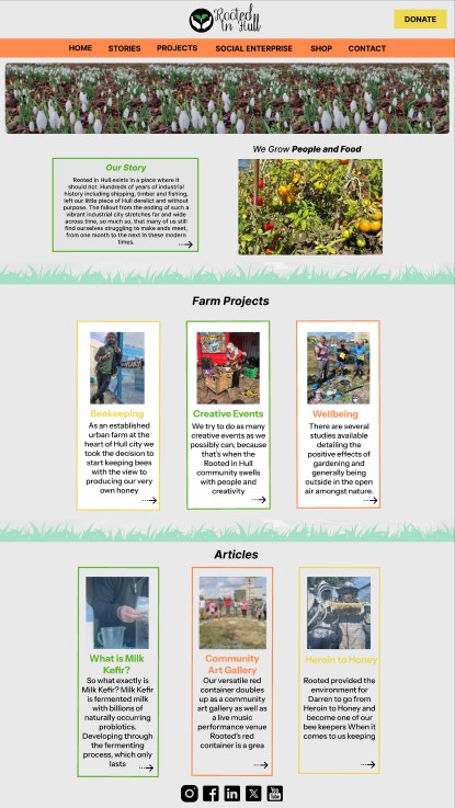
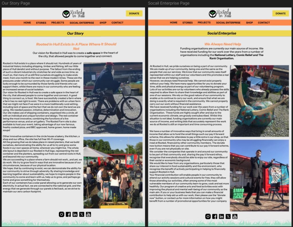
For the other pages below the left-to-right layout has been implemented. The original layout on the Rooted in Hull website for these pages was very difficult to read, as the large text paragraphs were placed next to each other which created a very text heavy section. This was a problem as it was hard to see where a sentence was supposed to finish as it continued underneath rather than going across the page like one would assume. With how the layout has been designed now, the large paragraphs are much easier to read. The images next to the text also break up the text heavy section and bring colour to the page, this is also the case with the headline and blurb added at the top.
References:
Wikipedia (2025) Hull Coat of Arms. https://en.wikipedia.org/wiki/Kingston_upon_Hull#/media/File:Coat_of_Arms_of_Kingston_upon_Hull.svg [Accessed 11 February 2025].
Rooted in Hull (2025) Rooted Homepage. https://rootedinhull.org.uk/ [Accessed 11 February 2025].
Rooted in Hull. (2025) Rooted in Hull Photos [Facebook]. https://www.facebook.com/RootedInHull [Accessed 11 February 2025].
Figma (2025) Figma Design. https://www.figma.com [Accessed 11 February 2025].
1001 Fonts (2024) Roots – Raise the dead font by chrisvile. https://www.1001fonts.com/search.html?search=roots [Accessed 11 February 2025].