A Good Example of Colour
For a good example of colour, let us look at this Metallica poster. It is immediately very eye-catching by its use of bright blues and reds. The blues stitch together the band title to the skeleton image creating a nice cohesion and incorporates the title nicely as the focal points. The blue is used to represent the lightening, this is created by the zigzagging strands shooting off from the outline, and by the different tones of blue particularly in the mouth and eyes. The almost white shade being gradually changed into a more saturated blue giving off the impression of a spark and energy. This variation in tones creates a much more interesting image than using flat colour. The blue is also used to create the second skeleton head using the negative space of the background, creating a nice soul like effect.
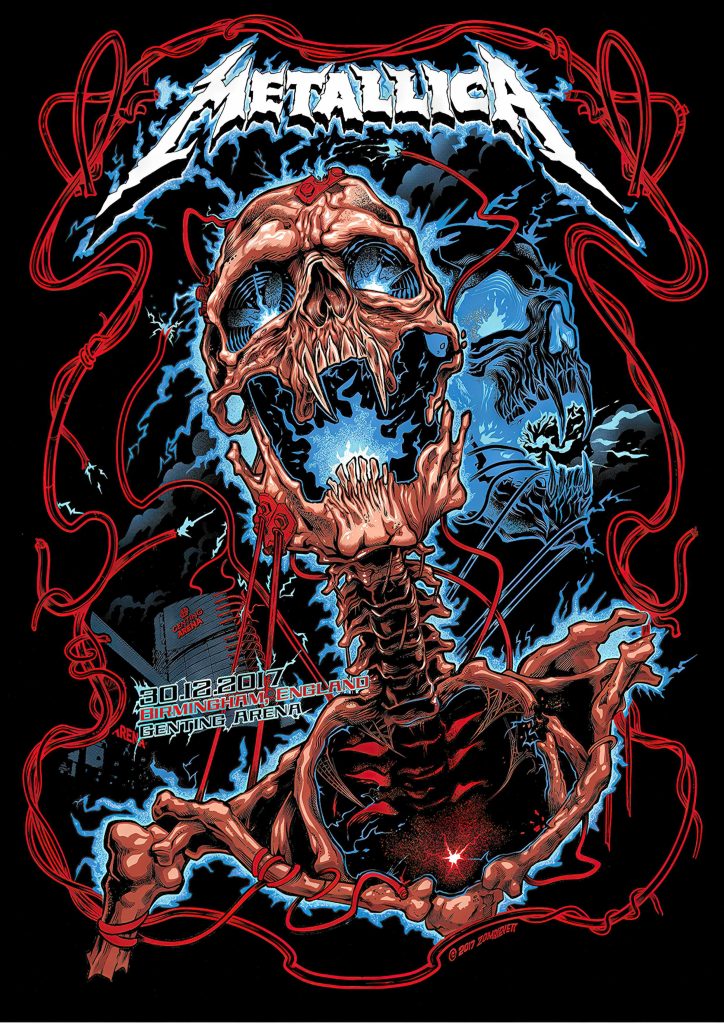
The red is also fitting with the imagery of the skeleton vampire corpse as it is indicative of blood. However, it also creates wires that almost resemble barbed wire feeding into a small area which is the arena where the concert will take place. The wiring gives a nice boarder to the composition which draws focus into the centre. It is more of a flat colour, not having as much tonal variation which allows it to have slightly less impact than the blue again making sure the focus is on the centre. For the bones they have gone with a more of a nude colour palate with a slightly red tinge, using a few colours to bring out the depth and shading which gives off a more realistic and alive feeling to the skeleton. This is also the most detailed use of colour on the poster highlighting this as the focal point. The colour used on the Metallica logo is a very bright white which allows it to stand out because of the strong contrast with the black background. The colours chosen all complement the idea for the design and give off a very striking image, this is why it can be used as a good example of colour.
A Bad Example of Colour
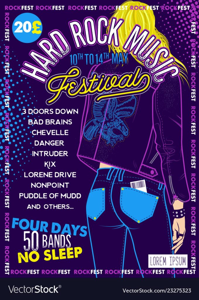
Due to the colours chosen your immediate thought would be a rave or a nightclub event, rather than a rock music festival. They create too much brightness and no real dark areas, creating a lack of contrast which makes it difficult to focus on any one part. The colours do no complement each other either, clashing and competing for the viewer’s attention. They have mainly used block colours which isn’t very visually interesting again contributing to the lack of clear focus. The one area with more colour details is the hair, using different tones of yellow, however, this is overshadowed by the title mostly covering it. The darker shade of blue for the date of the event, makes it look duller and drowns it out, when it should stand out as an important piece of information. The grunge effect on the lower part of the letters on the title has a similar effect, making it less eye-catching.
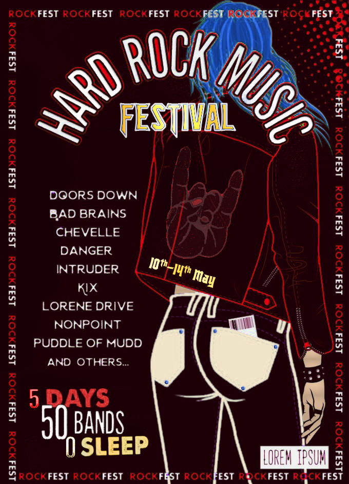
To improve this poster the first step was to change the colour scheme to a red, gold and white. This stops it having that nightclub/rave look and makes it fit more with the rock theme which it is advertising, all changes made are partially for this reason. The darker background with the reds creates a stronger contrast for the text. The new azure blue hair colour is because a lot of rock fans have colourful hairstyles, and it gives more contrast to the title, giving that greater priority. The blue eagle logo was changed into the red rock-hand symbol, coloured to fit the theme. The date has been moved to the lower part of the jacket, this was because the original looked out of place and was breaking up the visual flow of the title. Now the colour and font add consistency to the ‘festival’ text, and it’s placed where the viewers eyes will naturally go to, as this is just below a key part of the only image on the poster.
References:
Zombie Yeti. (2017) Metallica Gig Poster. Available online: https://www.garrreynolds.com/preso-tips/design/ [Accessed 26/10/23].
Moloko88. Hard Rock Festival Poster. Available online: https://www.garrreynolds.com/preso-tips/design/ [Accessed 26/10/23].