A Good Example of Composition
Looking at this poster we can use this as a good example of composition due to it being a well laid out and clean poster. The designer has split the poster into fifths, leaving a fifth at the top for the title, a fifth are the bottom for the date, location and background image, and the biggest section three-fifths of the poster being for the band titles. This creates an immediate hierarchy drawing the viewer to the most important part, the big named bands. The font style also play into this, with the bands all having their own unique logo fonts and these being the largest text on the page. Having such a large portion of the page allows them to have plenty of space, even at this size making sure they are easily recognisable.
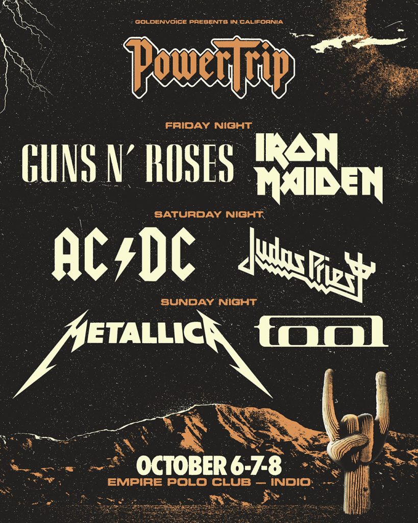
There is a clear hierarchy of type mainly created by the text sizes, styles and colours. As previously mentioned, the band names are at the top, the second would be the title “PowerTrip”, this is a similar size to the band names and done in a similar font style, with an orange colour to differentiate. It is only secondary due to the bands taking up a larger portion of the poster, making them more of a collective. Third would be the date of the event at the bottom, it is in a slightly smaller font but nice and noticeable due to it being in the same contrasting ‘white’ as the band names. Finally, we have the other information such as the location and the nights. These draw less attention being smaller than any of the other elements, but again are very clear due to using the same colour as the “PowerTrip” title.
The fact that they consistently use two colours to mix up the information and headings creates a nice composition that is easily readable and leads the viewer to the right information. The background also ties into the compositional divide roughly keeping the main part of its image to the bottom fifth. Allowing room for the main text, while the image is also subtle enough to not take focus from the date.
A Bad Example of Composition
Looking at the poster below you are immediately overwhelmed with information. Your focus is drawn to the “Slipknot” band name, and the “Knot Fest” title being just behind that, which shows where to focal point is. Afterwards, everything else gets drowned out because there isn’t a big enough difference between the rest of the band names. The “deftones” name is too big and has a black stroke around it, which none of the other names have, once again confusing the viewer on where to look.

Looking underneath you can see “Lamb of God” and “Dethklok” have being placed in an awkward spot due to the use of the backgrounds bright colours which stops them from being clear to the viewer. The remaining band names are all in similar sizes and the placement between them is very minimal, so they become difficult to recognise. The background image is a poor choice as it only serves to add more visual clutter further ruining any chance of a clean composition.

The layout of this poster is far too crowded, with the text almost overlapping between the “tickets on sale” and “Slipknot”, and between that and “deftones”. Other than the title nothing has any space to get your undivided attention. These is also no consistency to the layout, one piece of information is randomly in the left centre, but then another is in the lower right. Those two also break up the kind of ‘pyramid’ shape that the designer tried to create with the band names.

On the improved poster above, the elements have been made smaller and there is now three clean lines for the band names. This has freed up space which makes the poster have a more organised layout. This also gives the poster a clearer hierarchy of type and gives a better visual flow. The background has been slightly blurred and desaturated which makes the band names stand out and more easily readable.
References:
PowerTrip Poster (2008). Available online: https://www.8975.co.uk/gourmet-coffee/ [Accessed 26/10/23].
KnotFest Poster. Available online: https://knotfest.com/pages/festivals [Accessed 26/10/23].