Since the web is accessible across many devices and formfactors a reactive website allows users to get a coherent experience regardless of how they access the site. When creating a website, it is important to think about the pages responsive design as this will have a big effect on the user’s experience. Responsive designs adjust to the screen size automatically, which then makes it easier for the user to navigate around the website. Below are two examples of different websites, the first is a good example of what a responsive design should look like. On the left is how the page is viewed when using a computer and on the right is how it looks when using a mobile phone.
Hallowscream York.
As you can see the navigation menu when viewing it on a computer screen stretches across the page, but when using a phone, it is replaced with a hamburger menu which is a navigation tool. Here the user would click on the hamburger icon, and this would reveal the links to other pages. The purpose of this is to keep the screen clutter-free by using a hiding option to improve usability and overall satisfaction. A few techniques used in responsive design are breakpoints which determine how the layout appears on different screen sizes, this is also similar with flexible images. You can see that the content repositions to fit the width of the device that is being used on the homepages, whereas on the other page a carousel component is used to replace the box grid layout making it easier for the user to operate.
The Old Forge Sewerby.
Looking at a poor example of responsive design, the content size has not been adjusted and there is no organised layout structure, so the call-to-action button is covering the photo. All the text is centrally aligned with no obvious hierarchy making the information group together creating a poor user experience as its difficult to find what they are looking for quickly. The whole design layout comes across very dull and generic as it is very text heavy due to the lack of pictures and colours.
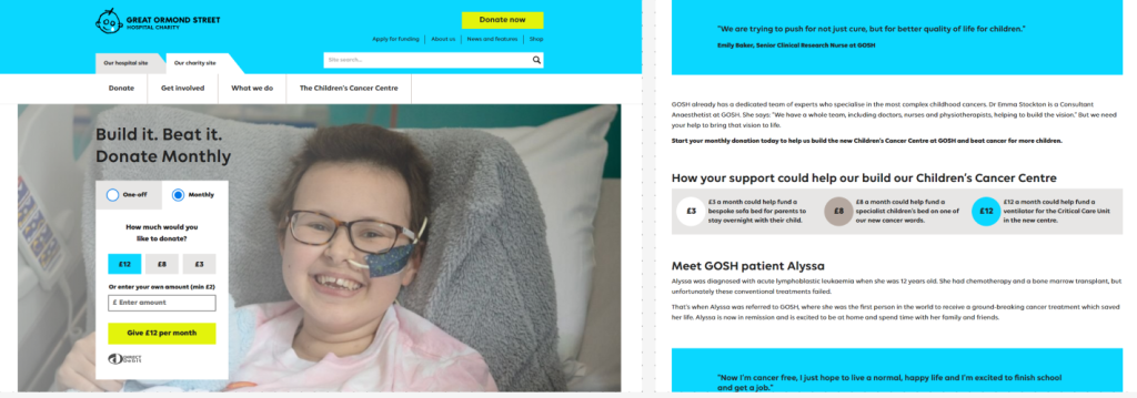
The layout and grid system chosen can determine the success of a website. Having an organised and aesthetically pleasing layout, where the content has an obvious hierarchy of type and grid systems are in place will make for a better user experience. As well as having obvious focal points and using images and colour to avoid any text heavy sections making it easier to navigate through the site. Below is a nice example of a website layout that has obvious call-to-action buttons, simple navigation menu and uses colours and images to break the text down to create a more interesting layout.
Accessibility is an important factor in web design as it allows people with disabilities navigate websites and feel included. Some features to include are access to different languages, colour contrast, resizable text and text-to-speech options. Below is a brilliant example of the accessibility options found on the Yorkshire Wildlife Trust website.

Referencing –
York Maze Hallowscream (2024) Hallowscream Homepage. https://www.yorkmazehallowscream.co.uk/ [04/11/2024].
The Old Forge Restaurant (2024) The Old Forge in Sewerby Homepage. https://theoldforgesewerby.co.uk/ [04/11/2024].
Great Ormond Street Charity (2024) Hospital Charity
https://www.gosh.org/ [Accessed 04 /11/2024].
Yorkshire Wildlife Trust (2024) Non-gov Charity Accessibility Menu
https://www.ywt.org.uk/ [Accessed 04 /11/2024].