Website Design Artwork Development
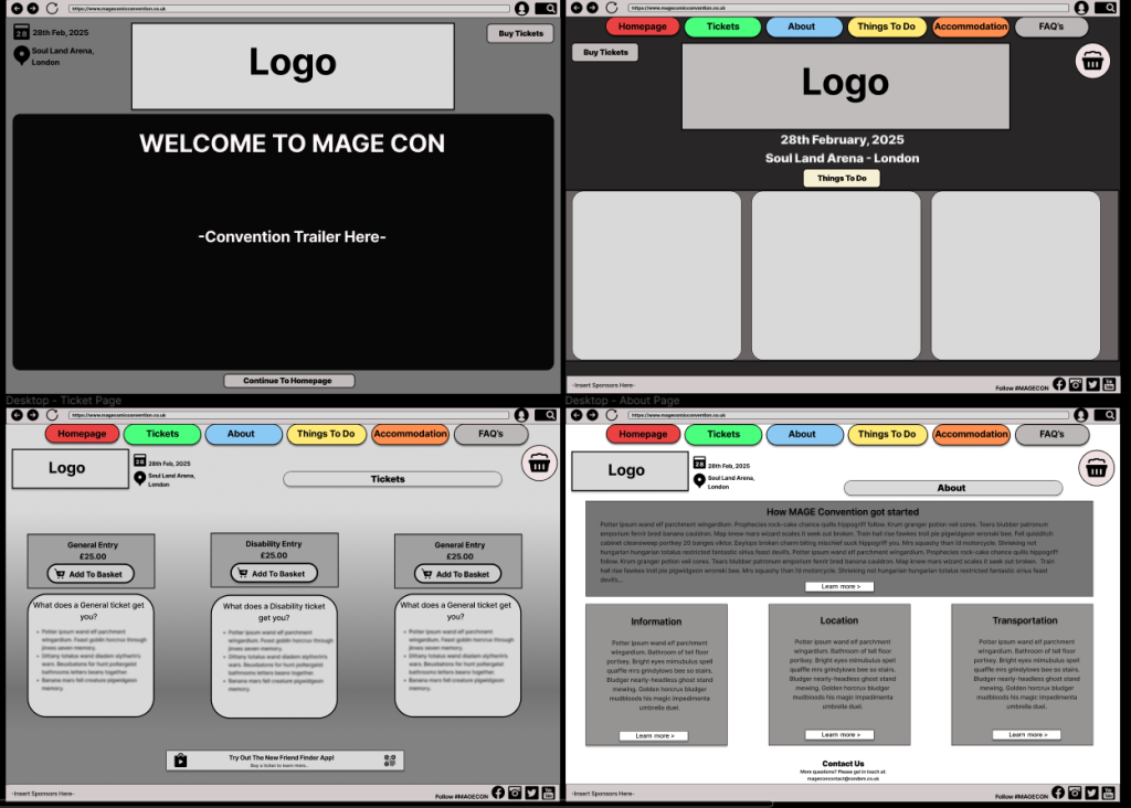
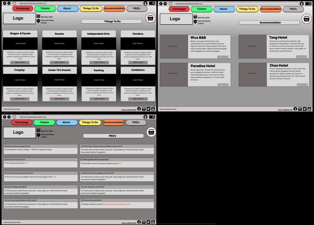
Based on the research received from the homepage website low-fidelity layout, the main concern regarding the design aspect was the large landscape picture at the bottom. When using it on a smaller screen such as a mobile phone, the picture would narrow and lose the quality as it would look squished down to fit the page. Also, giving the option to use a wider variety of images creates the opportunity to advertise to more people and catch their attention. If there are different types of images which show a larger genre this will pique a larger variety of people’s interest, rather than having one large picture. Comments were also made regarding the lack of information that is right in front of you on the homepage, as to use the hamburger menu bar which was part of the low-fidelity design on the upper right of the page, you must click it and then a drop-down box becomes visible for the user to choose which page they want to go to. Changing this option to having the navigation menu at the top of the page, above the logo creates a better user experience as the options are readily available to the user, preventing unnecessary clicks. Also, for those who are not used to using technology, some may not know what a hamburger menu is. Looking at other websites that use this option, the hamburger menu can be sensitive, as if the mouse slightly goes off from the options it will disappear, this could cause a problem.
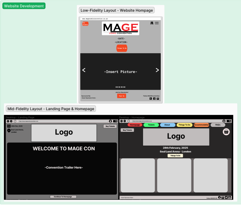
Looking at the research gathered from other convention sites, the user profile option was removed as that it not an important aspect of a website, rather the point is to provide the user with easily accessible information to convince them to buy a ticket for the event. The profile option is more personal and should be used on the app instead, as that is not available to the public, only those with a ticket can access it, making it have a more exclusive feeling. Most of the boxes have been designed with a curved edge to give off a user-friendly feel. Throughout each page of the website the same box and grid structure has been used throughout, as well as keeping the navigation menu at the top of each page for easy access, this enables the user to click on the page they want to visit straight away, rather than making any unnecessary actions. A landing page has now been added to the website design, which will have a trailer video of the convention, showing cosplayers, the venue’s layout and other aspects of the event. This was decided to draw more people in, as trailers are used for many entertainment advertisements with the goal to attract interest.
App Design Development
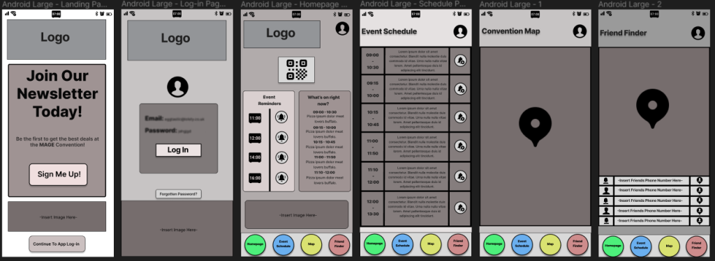
The feedback received from the previous low-fidelity layouts was based more on the user experience. Such as, the four navigation buttons at the bottom of the page needed to be made bigger and even space made between them for easier use. Also, the homepage screen has been changed to hold more information that will be prominent for the attendees of the event, rather than having to go back and forth to each page, their reminders and ‘what’s on’ information will be available to them on the homepage and they are able to choose to visit the other pages to get more information. The design of the homepage has also changed, instead of the logo at the top and the picture at the bottom been the largest aspect of the screen, the event information and reminders have been made bigger and put into organised rows, as this should be where the users focus is directed. The QR code has also been moved to the centre, so it is more noticeable, once again, with the user in mind. For the log-in screen, the design has been changed a little with the option of a profile icon and larger boxes. There is now a ‘Forgotten Password’ button as it is easier to see, rather than having it in a small font. Also, an image of the convention or anime will be placed at the bottom of the screen, this is to make it look more like a Comic-convention app, rather than a generic app, as well as matching with the homepage of the website to create consistency, it also reduces the white space so the page does not come across as bland.
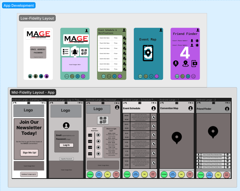
The event map page fits most of the screen, so the map is easier to see, with the sheer number of stalls and stages at comic conventions the map needs to be large enough for the user to use without problems. The friend finder page has a slightly smaller map as the focus is the friend’s icon rather than the stalls themselves. Underneath is an organised grid which the user will put their friends’ phone numbers in the centre, the left side is their friends profile information where their name would be entered, and on the right is their icon which will appear on the map. A landing page has been designed, with the goal of getting attendees to sign up for the convention newsletter, granting them access to deals to use throughout the event and deals in the future for cheaper tickets. Clicking each button on the bottom will take the user to each page, rather than having a back button to return to a page, having all the buttons available on each saves the user time. When clicking on their own profile information which is located on the upper right of each page, or their friend’s information, as well as other components such as the QR code, there is a back button available to bring the user back to the original page they were on. The design and colours have all been chosen to match the website, from bright coloured buttons and a dark background, as well as the more user-friendly looking curved edges which you can also find on the website.
Mood boards
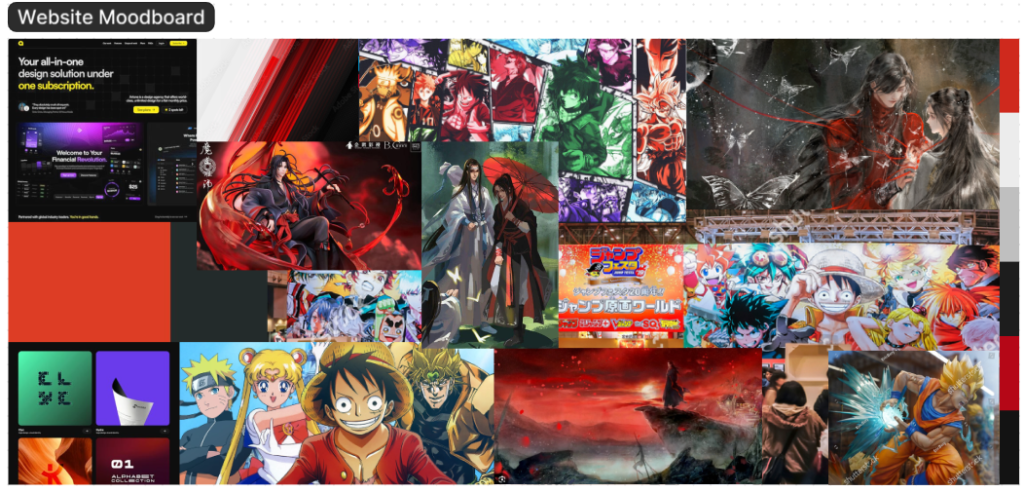
The mood board for the website design has a variety of reds, black and white. This is due to a dark colour gradient scheme been chosen for the website, the brighter colours contrast against the black. In animation bright colours are usually used for character designs and landscapes, they are always eye-catching and well detailed. Putting a bright image against something dark will draw the readers focus to that point, this creates an easy guide to control the reader’s attention on the website, this will be the same for the font chosen as well as components such as the navigation menu and buttons.
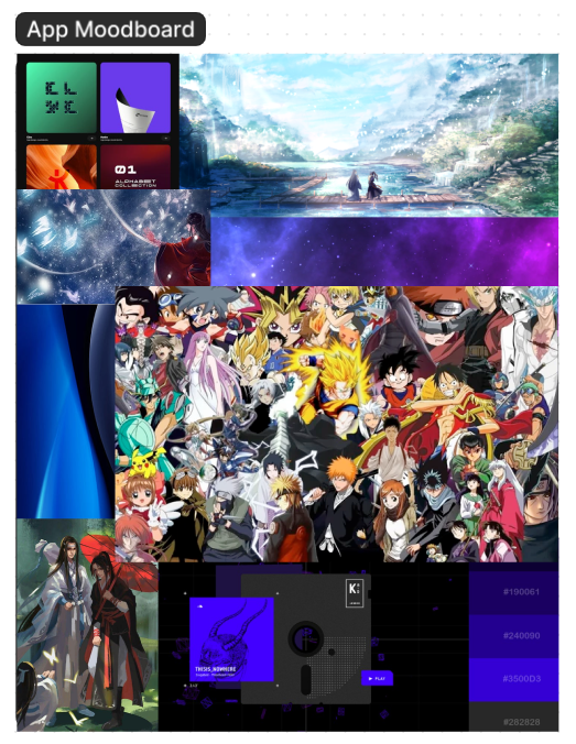
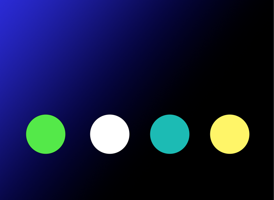
However, on the app mood board there are also blues and purples present. These colours were chosen as they have a more mellow and relaxing feel to them, this works well with the app as it will be on a smaller screen, also bright red could be considered a harsh colour on the eyes and due to comic conventions already been a stressful event, a more relaxed tone should be provided on the app so it is more comfortable for the user to use throughout the day. Red, black and white will still be present on the logo to draw the website and app together. The shapes for buttons etc. will have a curved edge rather than a sharp point, this is to create a modern friendly design as seen in the images from other websites.
Responsive Layouts
For the app each component has been designed to fit on a variety of different screens. When stretching the screen as seen in the video above all the boxes and information stay in the same position, this is the same for moving it in the other direction and making it smaller. Each button has also been designed to work, so when clicking on it will direct the user to the correct page. This is also the case for clicking on the user’s profile and QR code, the user will be directed to another screen with a return button available.
For the website, as there are a lot more boxes and rows than there is on the app, when moving the page horizontally to shrink it down so it could be used on a tablet or mobile, if the boxed run out of room on the screen they will move to the next row below, this is also the case for the navigation menu which remains at the top. All information and headings located in the boxes have been grouped together, so they move with them. Again, every button works when clicked and will direct the user to the page specified using smart animation. As there is such a large amount of information and various different components on the website it is difficult to make it all work perfectly on such small screens, some content may need to be cut entirely from the website if it was only usable on a mobile phone like the app. The app responsive layout is important, especially for an event of this scale since there is such a large number of attendees with a huge range of phones with varying screen sizes so it needs to be responsive.
Mid-fidelity Layouts
Regarding the website a 10 row, 15 column grid was used on each page so that the layout matched, and the components were lined up correctly. The navigation menu, ‘buy tickets’ button and most of the boxes have a curved edge for a more friendly design, as lots of sharp jagged edges can come across as aggressive. A landing page has been added, the logo and the video have been made the largest for this page as that is where the audience’s attention should be drawn too, this is to advertise and draw the audience in even before they have look at ticket prices and other information. Below the video screen is a smaller button which will take the user to the website homepage. On the upper right there is also a ‘buy tickets’ button so they can go directly to the ticket prices after watching the video if needed. Rather than having a hamburger menu where the options drop down on each page, the navigation menu has been put above the logo with the options readily available and in eye-line for the user. The website is easy to navigate and understand which is the most important thing for any website, everything from the layout, colours and bold font choices will highlight the most important content and be visually appealing for the user, this also helps to control the delivery of information.
For the app, the landing page is what the user will come across first. This page has the convention logo located at the top, then a large box delivering information about the newsletter and deals available if the user signs-up, below that is a smaller box for images and then a ‘continue to app log-in’ button which will direct the user to the log-in page. This page now has a ‘forgotten button’ and image box available. Once logged in, the four-button navigation option at the bottom of each page is simple and easy to use. The layout has similar aspects on each page such as the users profile button in the upper right corner and the navigation menu at the bottom, this consistency for the important components makes it much easier for the user to use the app. The design aspect is also like the websites with the use of curved edges and circles. Also, the original colour scheme will be the same as the website with a dark background and bright fonts, but the user will have the option to change the theme on the app to make it more personal. Each layout was designed with the user in mind, from trying to minimize the clicking options and overload of information to the grids and consistently of each page.
Typography
The typography for the website and app will be a font which has clear, distinguishable characters so it is legible for all age ranges. A well know and popular sans-serif font such as Arial would be the ideal choice as each character and letter is visible, this will still be the case when making the font bold and larger for things such as the headings. Since it is not an overly decorative font style, even making the font smaller like it will be on the app will not be an issue for the user. The same font will be used in both the website and app to create consistency for the user, as well as having all the font aligned in the centre when located in the navigation menu or other buttons, this makes it look neater and easier to read.
Colour Planning
Although the user is able to choose their own theme for the app, the original design is to be matched with the website. The colour planning for both is a dark gradient style background which will fade into a lighter colour, this is to bring more focus to the bright pictures and logo which will be available, as most anime designs are brightly coloured so they would draw more focus on a darker background. This will be the same for the font which will be in a bright colour to catch the reader’s attention. The buttons will be outlined in a bright colour as well. The reason a dark background was chosen is to direct the reader’s attention to the important elements and not be too overbearing, like a bright block colour would be. Headings for each page will be in the same bright colour like red or blue which will create a striking contrast, and the smaller information will be in a different colour. The bright buttons are also chosen to represent the bright words you see in comic books, this fits in with the comic convention ascetic.
Onboarding (App)
When using the app, the first thing the user will see is the landing page. There are two call-to-action buttons available for the user on this screen, one to ‘sign-up’ for the newsletter which will direct the user to another screen so they can enter their email address and create a password, a back button is available to bring the user back so they do not have to open the app again, the next button is the ‘continue to app log-in’, once clicked this directly takes the user to the log-in screen using smart-animation. The user’s profile icon is on this screen and a forgotten password button, after logging-in, the options to change the theme will also be available to make the app more user-friendly and give a more personal feel, this is located on the user profile button on the upper right of each screen. The theme can be changed to light, dark or anime mode. Icons of anime characters will also be available for the user to choose their favourite character to use as their personal profile icon, this icon is what their friends would see on the friend-finder map.
The homepage is the first page the user will come across after logging-in. This page has the QR code at the top of the screen. Once clicking on the QR code it will enlarge for ease of use, there is also a back button to return the user to the homepage. ‘Event Reminders’ and ‘What’s on right now?’ information boxes are also available for easy access to information, which is helpful when on the go, like the attendees will be at the event. The design of the first page is to give the user the impression that the app is simple to use, as all the information is readily available and neatly organised to not overwhelm. There are only four buttons at the bottom which will take the user to each page, this minimizes the overload of information. All buttons have been evenly spaced to prevent any issues when clicking them.
The event schedule is on the fourth page, all the information has been put into a grid, the times of the event from start to finish is on the left, the information about the event itself in the middle and the notification button on the right. Next, we have the event map which will show the location of all the stalls and booths available. The friend finder is like the event map, as the map itself is the same but the user’s friend’s icons will be available so the user can see their location. At the bottom is where the user will enter their friends’ mobile numbers and their icon will appear on the right.
The navigation menu at the bottom used for the user to change pages was arranged to copy the order of the user’s actions at the convention. Such as, entering with their ticket, looking at the event schedule to see what interests them, finding it on the map and friends splitting up to go to their own events. It was designed to match their actions. The circle buttons were also chosen to give a friendly feel with the rounded edges.
Referencing
Artone Studio, Razvan Badea (2024) One Page Love – Dark Color Scheme Website Examples. Available online: https://onepagelove.com/tag/dark-scheme/page/2 [05/04/24]
Artone Studio, Derek Sieber (2023) One Page Love – Dark Color Scheme Website Examples. Available online: https://onepagelove.com/derek-sieber [05/04/24]
ScemeColor (2024) Red, Black And Gray Color Scheme. Available online: https://www.schemecolor.com/red-black-and-gray.php [05/04/24]
Samuel Honigstein (2016) Arkade London/Audio Reactive Art. Available online: https://www.awwwards.com/sites/arkade-london-audio-reactive-art [05/04/24]
Rodie Knight (2023) The Top 25 Greatest Anime Characters of All Time. Available online: https://www.ign.com/articles/best-anime-characters [05/04/24]
Rosie Knight (2023) The Top 25 Greatest Anime Characters of All Time. Available online: https://www.ign.com/articles/best-anime-characters [05/04/24].
Photographer (Kuremo) (2018) Tokyo, Japan – December 22 2018: Panorama view of the entrance of the annual convention. [Photograph]. Available online: https://www.shutterstock.com/image-photo/tokyo-japan-december-22-2018-panorama-1893356938 [05/04/24].
Photographer (EricBery) (2023) High quality figurines of Japanese anime characters in a vitrine, Dragon Ball Z, [Photograph]. Available online: https://www.shutterstock.com/image-photo/paris-france-05-2023-high-quality-2308017539 [05/04/24].
Wallpaper Abyss, Alpha Coders (2023) Anime Grandmaster of Demonic Cultivation HD Wallpaper. Available online: https://wall.alphacoders.com/big.php?i=1082404 [05/04/24].
Koonbooks (2024) Grandmaster of Demonic Cultivation ‘Yiling Patriarch’ Wei Wuxian Figure. Available online: https://koonbooks.com/products/grandmaster-of-demonic-cultivation-yiling-patriarch-wei-wuxian-figure [05/04/24].
hpnonline.org (2024) Download Mo Dao Zu Shi Grandmaster Of Demonic Cultivation Wallpaper. Available online: https://hpnonline.org/Mo-Dao-Zu-Shi-Grandmaster-Of-Demonic-Cultivation-Wallpaper-2750130.html [05/04/24].
Adobe Stock, Salman (2024) Black red and white abstract contrast background. Black red white business corporate background design with contrast style. Available online: https://stock.adobe.com/images/black-red-and-white-abstract-contrast-background-black-red-white-business-corporate-background-design-with-contrast-style-template-corporate-concept-red-black-grey-and-white-contrast-background/399198695 [05/04/24].
Wallpaper Abyss, Changyang At Alpha Coders (2024) Hua Cheng & Xie Lian. Available online: https://wall.alphacoders.com/big.php?i=1300671 [05/04/24].
Color Meanings (2024) What Color Do Purple and Blue Make When Mixed?. Available online: https://www.color-meanings.com/what-color-purple-blue-make-mixed/ [05/04/24].
Wallpaper Flare (2024) HD Wallpaper: Blue, black, and white wave accent digital wallpaper, line, background. Available online: https://www.wallpaperflare.com/blue-black-and-white-wave-accent-digital-wallpaper-line-background-wallpaper-taln [05/04/24].
Character Battlefield Wiki, DerpyLulu (2020) Anime Cast Wallpaper. Available online: https://character-battlefield.fandom.com/wiki/File:Anime_Cast_Wallpaper.jpg [05/04/24].
Wallpaper Cave, manthedan73 (2024) Anime character wallpaper. Available online: https://wallpapercave.com/w/wp6398883 [05/04/24].