Defining the UX for you Festival (Defining problem space, Usability Goals etc.)
The project idea is for an entertainment media conventions, to be names MAGE. An acronym for Manga, Anime, Gaming, Entertainment, a few of the biggest mediums that will be the main draw for the event. The problem space for this event is varied, from location, accommodation, transportation, providing a variety of different content for the attendees, to their safety, and any cancellation issues or postponed events. The usability goals for this convention are to provide a safe and enjoyable event for all the attendees, as well as promote the different content available and merchandise to be sold.
For the website a printable map will be available for those who do not have access to a mobile phone. On the app there will be a navigation option to help find the venue. The app will also provide QR codes in the form of a ticket which are to be shown on entry, this will be found on the app homepage. Whereas the website will offer an option of an actual ticket which could be sent to their home or picked up on the day of the event. For the app these will also be a ‘Friend Finder’ feature, this is because attendees will usually attend in groups or families, and at points they may need to split up to see different events that are happening simultaneously. Due to the immense size of the venue, the density of people, as well as all the many booths and stages, this can easily lead to people losing their friends. This feature will help provide a simple accessible solution to that potential problem and also give those attending a layer of safety.
For the event schedule, there will be an option for notification reminders on certain events for those using the app, to avoid those attending missing events. On the website all event information will be provided and an event schedule booklet is to be given to everyone on entry, this is to make the information accessible for people without mobile phones or with other limitations.
Details on the different transportation and accommodation options will be provided on the website so people can plan their trip in advance. There will also be taxi numbers and private hire car numbers available on the app that will be available on the day of the event. These companies will be working directly with the MAGE Convention.

Requirements Gathering and Analysis
The audience for this event will be people from all ages and backgrounds who have an interest in either anime, manga, graphic novels, gaming or cosplay. These could consist of families with children, teenagers, adults, couples, friend groups big or small, or just individuals looking to meet people with similar interests.
When buying a ticket to the event on the website these will be questions regarding disabilities and assistance required, a separate entrance to the venue will be provided to avoid large crowds. The rules and regulations regarding cosplay weapons, props and code of conduct will be available on the website and app, as things such as sexual harassment is a problem mentioned from those who have attended other conventions in the past. An article was written by Sandy Cohen, stating allegations of sexual harassment from women who attended a convention. In which there was cat-calling and other forms of harassment (2014).
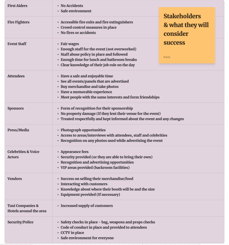
As seen from the graph provided below, there are various stakeholders for an event of this magnitude, and they all have their own expectations of what they would consider a successful event.
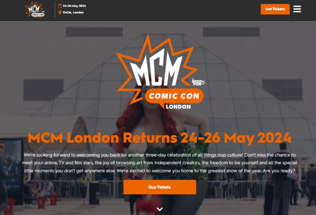
Looking at other comic-conventions websites, such as MCM and Leeds Anime & Gaming Con. They both use the old school layout, where the text is placed on top of the picture and a call-to-action button in the middle to buy tickets. The MCM app is also unable to be used without buying a ticket first, making it difficult to investigate the content of the app. However, based on experience of using it when I had attended the event in the past, it also has a notification function that enables attendees to keep track of the events taking place and any changes. It goes into a lot more details regarding the panels and events themselves than the website does.
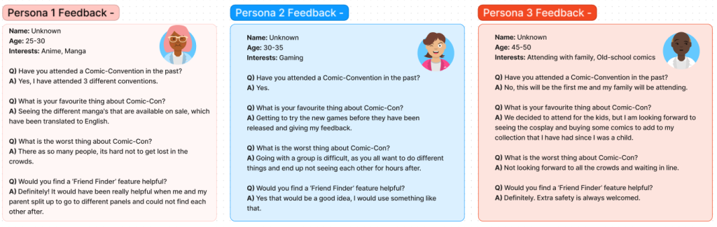
Based on secondary feedback from past attendees of different comic-conventions, their biggest concern was trying to navigate around the event due to the sheer number of people, and the concern of missing events they wanted to attend. The success of the app will be whether it is used/useful in helping event goers get the most out of their experience, by helping them see and attend everything they want to. While also assisting to make sure their needs and problems are taken care of efficiently.
UI principles to be applied to your design
The people using the companion app will be the event attendees, as the app itself is only available to those who have a ticket. One of the biggest issues for those attending is the possibility of losing your friends and getting lost. The app providing the ‘Friend Finder’ function alleviates this problem. A system would be in place to create a friends list, by adding and accepting each other on the app through their mobile numbers. This will allow them to share their live GPS data, which would interact with the app’s map, to make it show a real-time presentation on where your friends are in the venue. A small round icon of their profile picture would be shown, along with their username, which they can tap and choose to ping them, which in turn would notify them that their friend wants to meet up. Making it easy to find each other whenever needed. The feature is also designed for easy use, the only details needed are the attendees’ log-in details which they would have provided when buying their tickets and their phone numbers. It could also be used for arranging meet ups with certain fan-groups as an opportunity to make new friends and connections.
On both the website and app there will be as minimal choices as possible, this is to reduce the user’s memory loads, so they do not feel overwhelmed by the amount of information provided. The information will be clear and concise – with the most important information such as the date and location made to be more noticeable, either with a large font or bright colours. The app will be kept to a five-screen system, the first been the log-in screen, which will then take the user directly to the core of the app, the homepage which will include the QR code for their tickets for easy access. Four buttons will be available on every screen of the app so the user can direct where they want to go easily. These buttons will be in different bright colours and labelled so they stand out from the background.
Rejected designs
Looking at other comic-convention websites, the first call-to-action button you see is to buy tickets, with a large picture behind the text. After considering this idea for the design of the website at first, I realised that the most important aspect of the website should be the event information. Such as, the event name, location and date, but also the first call-to-action button should be the ‘things to do’ button, which will provide the information of the different events taking place at the convention to inform the reader of the reason why they should attend the event, this would grab their attention before looking at ticket prices.
Regarding the app, I thought about all the different kinds of information that could be helpful and even adding things like interactive games to play at the event. However, then the design seemed to be overloaded with too much information making it difficult to navigate through the app itself.
Deciding a simple style so that it reduces the user’s memory load and making the app itself simple to use for all age ranges. The interactive games could be integrated into other areas of the app, like the map itself. This still gives those attending the opportunity to participate in the games and keeps the app simple to use for those with less experience with technology.
Low fidelity UI prototype
Below are the low fidelity prototypes for the website and app. As stated above the layout for the website is designed to be aesthetically pleasing, informative and organised neatly so as to not overwhelm. The call-to-action buttons will be in a brighter colour to stand out and catch the audience’s eye, this is also the case for the title. There is a drop-down button on the upper right, which shows the other pages’ options. Keeping the pages organised like this makes finding information much easier. The homepage is the core of both the website and app.
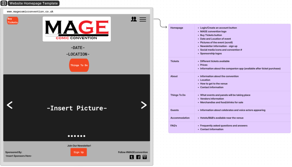
A hypothetical user could start off by heading to the website, which informs them of the panels, celebrities, activities and fun events taking place. They decide to buy a ticket and create a user account, so they can use the app. After purchasing their ticket, they then look at travel and accommodation options which are provided on the website. Afterwards, they log into the app and add their friends’ numbers who they will be attending the event with, then browse the event schedule, setting event reminders for what has caught their attention. When they arrive at the convention, they use the QR code on the app to collect their ticket and enter, receiving a paper programme from a friendly greeter as they do. They check the map to see what points of interest they’re near to and look at the different merchandise the vendors are selling. Within the program is information on all events taking place, vendors information and location within the map.
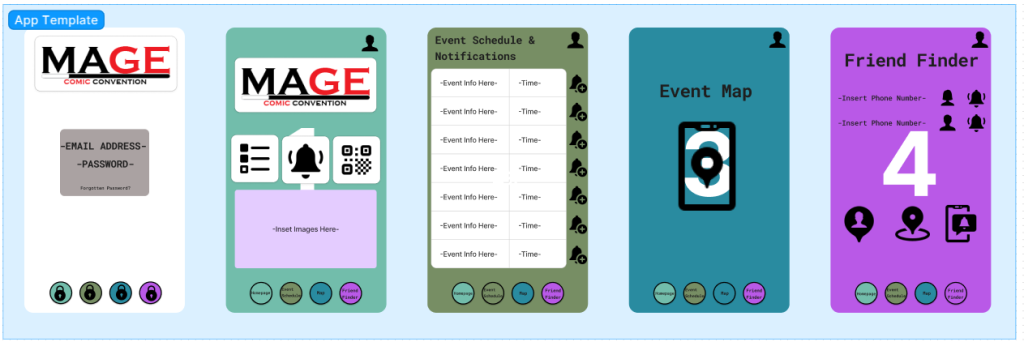
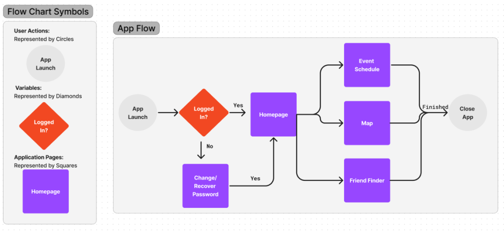
The app is sectioned into five screens, from 0-4. Screen 0 is the log-in screen which asks for an email address and password, these would be the same information provided when buying their tickets. Screen 1 is the homepage which has access to all the other screens, social media newsfeeds about the event, images, ticket QR codes, notification reminders, rules/regulations and images. Screen 2 is the event schedule and notifications. Screen 3 is the event map which will include the interactive games. Finally, screen 4 is the ‘Friend Finder’ function. On the bottom of each screen are the buttons for each page, this prevents the user having to go back to the homepage every time.
Referencing
Sandy Cohen (2014) Comic-Con’s dark side: Harassment amid the fantasy. The Seattle Times, Internet edition. 28th July. Available online: https://www.seattletimes.com/nation-world/comic-cons-dark-side-harassment-amid-the-fantasy/ [05/03/24].
MCM Comic Con (2024) Reed Exhibitions Limited. Available online: https://www.mcmcomiccon.com/london/en-us/home.html [Accessed 05/03/24].
Leeds Anime & Gaming Con (2024) Animeleague. Available online: https://www.leedsanimecon.com/ [Accessed 05/03/24].