A Good Example Of Typography
This Graspop Metal Meeting poster is a good use of typography as the font used is a solid, bold, San Serif 3D style. It cements itself as the top of the hierarchy of type on the poster, as the striking bold 3D style grabs the audience’s attention straight away and steals focus from everything else. The designer of this poster cleverly made the letters themselves look like iron metal due to the colour and 3D affect which was chosen. Indicative of the fact that it is for a heavy metal concert, and providing further visual attraction for this title, to the viewer.
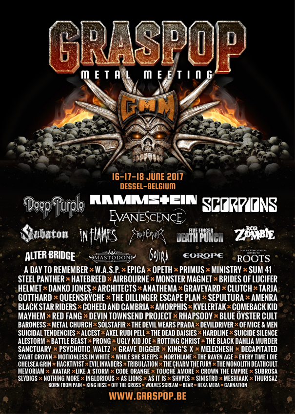
The ‘metal meeting’ underneath the event name is also in a San Serif font which is easy on the eyes and provides clear information on what the poster is about. The lettering is smaller and further apart so it fits perfectly in between the “G” and “P”, the extra spacing allows for increased visual clarity while also connecting it to the main title. The bright white colour stands out well from the black background so although it is smaller, it is still easy to see.
The event details are in a bright orange colour, distinguishing themselves from the other text to make this important information easily findable. Whilst it’s smaller size doesn’t draw immediate focus away from the event title. The first three lines underneath the details are used for the well-known heavy metal bands, who have their own logos and fonts which are bigger and get more space than the rest of the bands. Due to their larger fanbases, this makes it easier for viewers to see their involvement. Underneath are the less well-known bands. A clear bold white San Serif font is used and the orange “x’s” create good separation which helps them being clear to read. As you go further down the poster the font with the band names gets smaller, this is to show they are not as well-known, so they’re less important to the poster and require less space.
This poster has a lot of details from the band names, time of the event and the location, yet it is kept well organised throughout and does not overwhelm the audience with cramming the information together. The font styles are kept neat and clean, so it is simple to read, and nothing takes away attention from the event name, this is the perfect example of well used typography.
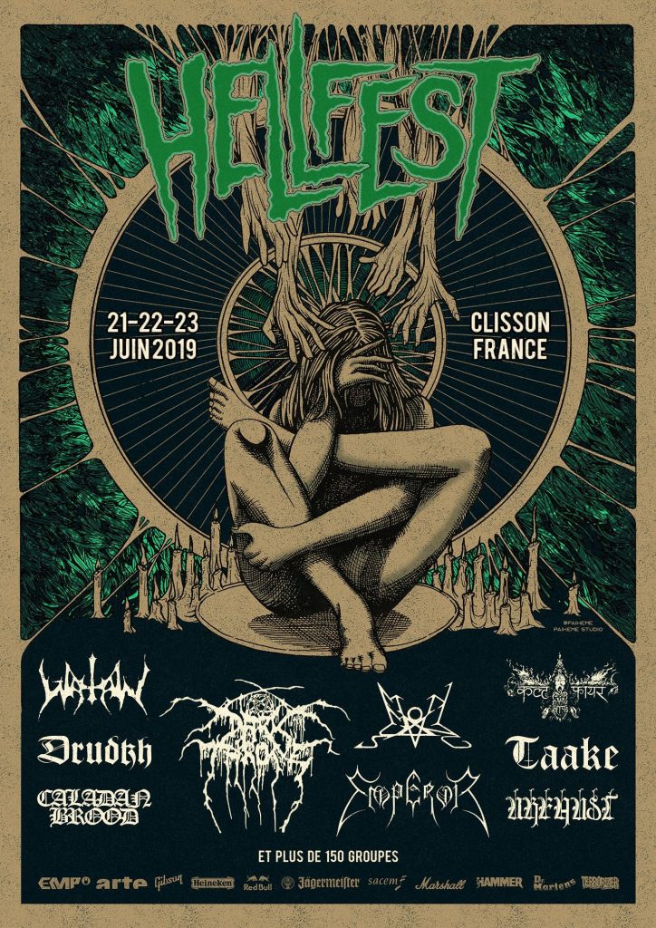
A Bad Example of Typography
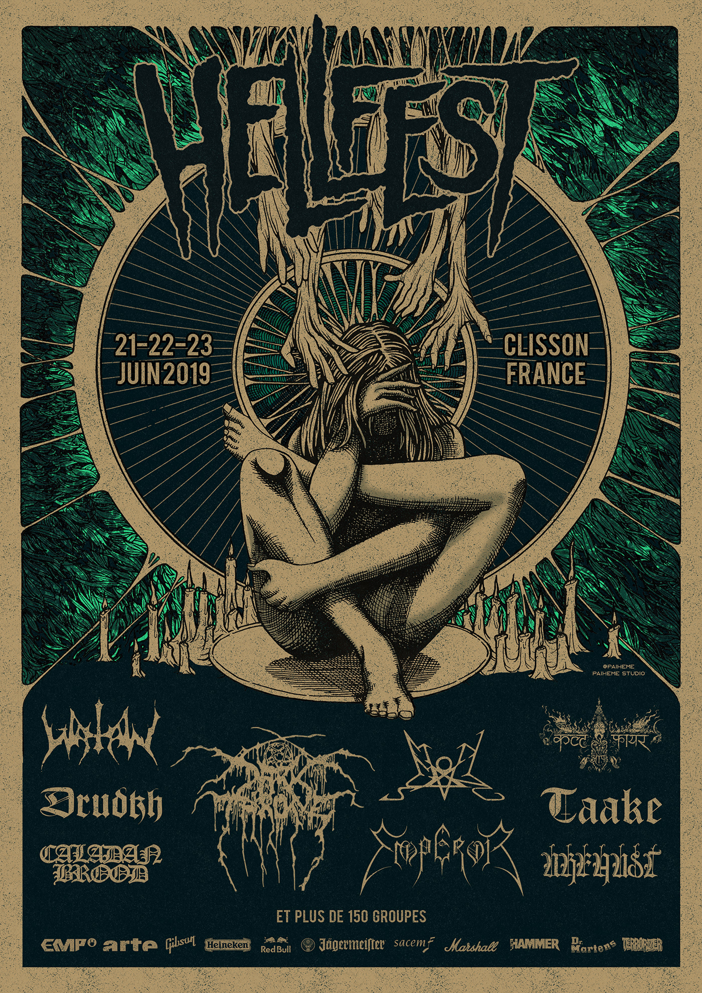
Hellfest Poster.
Looking at the poster above, your eyes are immediately drawn to the image rather than the title, event details or band names. The font used for the event details is a clean San Serif style, yet the colour used it the same dull cream that is in the picture, so it does not stand out and becomes easy to miss. The font used for the event title is once again a San Serif style, but the letting is very narrow, and the letters are remarkably close together. Some are even crowding on top of each other which makes it difficult to distinguish between the letters such as the ‘F’ could be mistaken as another ‘E’ at first glance. The colour chosen for the title is a slightly darker shade of blue from the background image so there isn’t much difference, and it all becomes very bland with nothing standing out, the arms coming down from behind the title could also be considered very distracting and stealing away focus.
At the bottom of the poster are the band names for the event, which use their individual logo fonts, so fans can recognise them. The poster itself gives off a brilliant heavy metal feel with the use of the picture, but everything else fades into the background and could be easily ignored by the viewer, that is why this can be used as a bad example of typography.
As you can see from the edited poster above the bottom of the ‘F’ has been shortened and disconnected from the ‘L’ letter. Also, the ‘L’ has been capped off at the end to stop it blending with the ‘E’, these small changes make each letter more recognisable and the title easier to read. The colour on the title, event details and band names have also been changed to a brighter and more noticeable colour to catch the viewer’s attention. The title also has a double stroke effect which makes it more striking and eye-catching.
References:
Graspop Metal Meeting Poster (2017). Available online: https://www.graspop.be/en/history/2017?_gl=1175d7gg_upMQ.._gaMTc4NTkxNTEzMy4xNjk4MzQyNTY4_ga_67RN05Z06G*MTY5ODM0MjU2Ny4xLjEuMTY5ODM0MjU4MC4wLjAuMA.. [Accessed 26/10/23].
Paiheme Studio (2017) Hellfest Poster. Available online: https://www.garrreynolds.com/preso-tips/design/ [Accessed 26/10/23].