Typographical Name Logo
Name Logo One – Black & Red
For this name logo I have chosen black and red for the colours. This is partially because they are my favourite colours but also because the contrast of the light and dark complement each other well. The red also represents an apple which works perfectly with the surname. The letters fit beautifully together from the way the curve fills the space above the two “P’s” and the way the “l” comes between the bottom of the “K.” The Serif font is very artistic with curls and flicks, the “K” also looks like it could be a musical note which is another reason I decided on this font.
Karla Appleton – Name Logo One
Name Logo Two – Pink & Purple
The colours for this name logo were chosen to show the more feminine side of my personality. The subtle pink and purple complement each other well and are not overbearing. Also, the way the initials overlap with each other fits nicely, rather than giving off a crowded look. The font chosen is a Serif style which has an elegant and youthful vibe. The opacity on the “Karla Appleton” has been reduced to create a more shadowed effect. However, due to the initials’ colours not being overly dominant it is still noticeable.
Karla Appleton – Name Logo Two
Conceptual Personal Logo
Personal Logo One – Candle
The black background creates a very bold image due to the contrast of the bright white and red colours chosen for the lettering. The two “l’s” which have been made into a candle, as well as the “O,” the two light and dark colours together in a circle are an example of yin and yang. These two focal points represent the spiritual aspect of myself. Although the San Serif font is very bold and gives off a modern look, it does not steal the focus away from the focal points. Altogether the logo gives a warm and harmonious vibe.
Conceptual Personal Logo One – Spiritual Candle
Personal Logo Two – Black Apple
For the last logo I stuck to a red, black, and grey colour scheme which are my favourite combination and complement each other well. It is a simplistic design with a more software company feel to it, yet the way the colours are layered together makes it more visually appealing. The counter of the “A” has been replaced by an apple; this is to represent the “Apple” in “Appleton.” The colours of the apple are the same used in the rest of the design to give it a nice flow with the initials. Also, the “K” is behind the circle, while the “A” overlaps above it. This, along with the greyed-out sections where the letters overlap, make it a lot more visually interesting and has been seen in more modern design work.
Conceptual Personal Logo Two – Black Apple
Illustrator Portrait
Portrait One – Abstract
The two artists which inspired this abstract portrait are Paul Klee (Senecio – Head of a Man) and Lorenzo Gonzalez Sanachez (Helena). Both artists use shapes for the facial features which I have also incorporated into my design. A cubism design was used for the skin tone with various pink and peach shades. The eyes and mouth have also been made using the ellipse tool and edited with both selection tools for a more realistic shape. The nose was made using the rectangle tool, as well as the bridge of the nose. Bold colours have been used throughout to create a more extravagant and striking portrait.
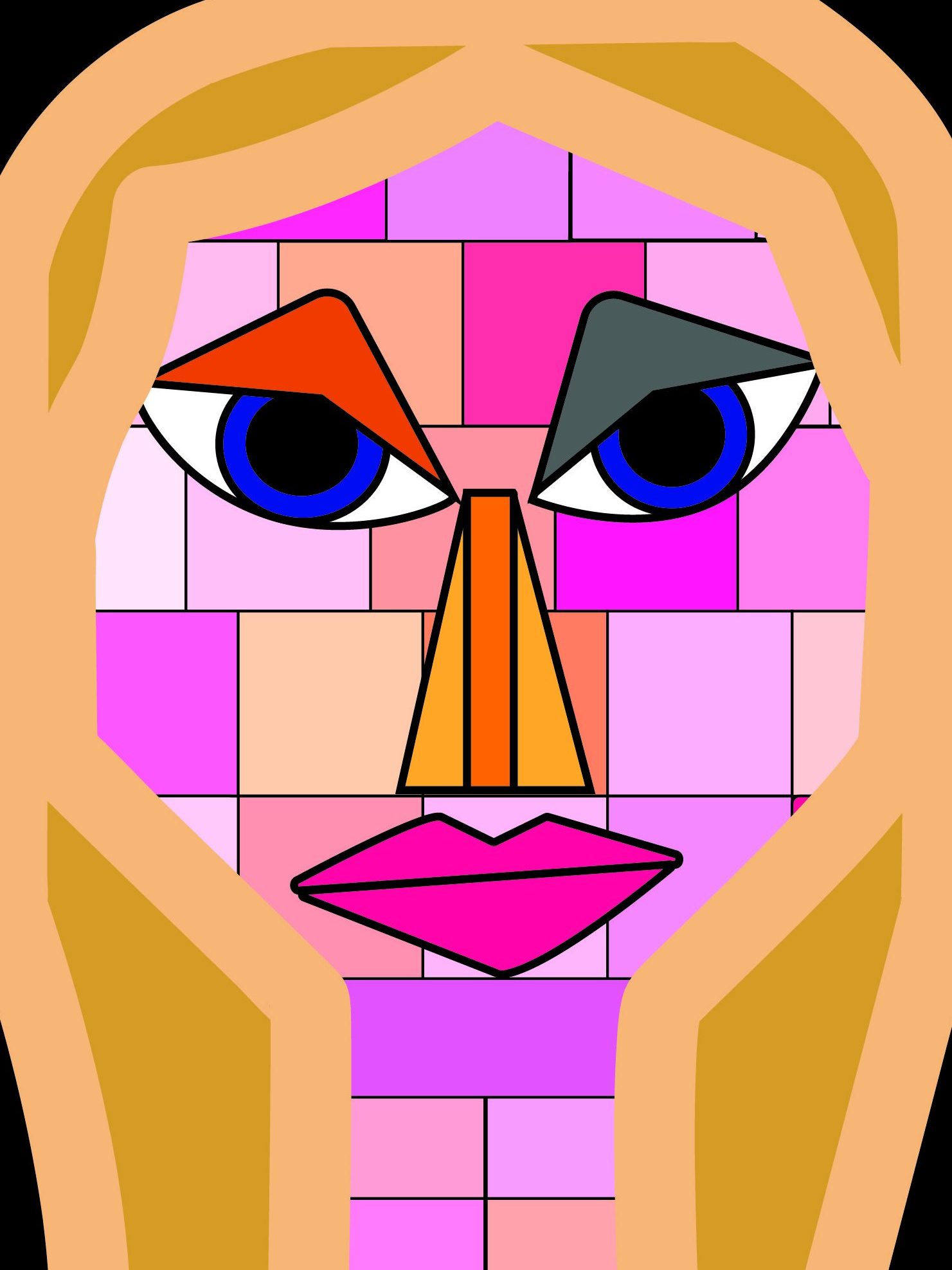
Illustrator One Abstract Portrait – Inspired by Paul Klee and Lorenzo Gonzalez Sancheze
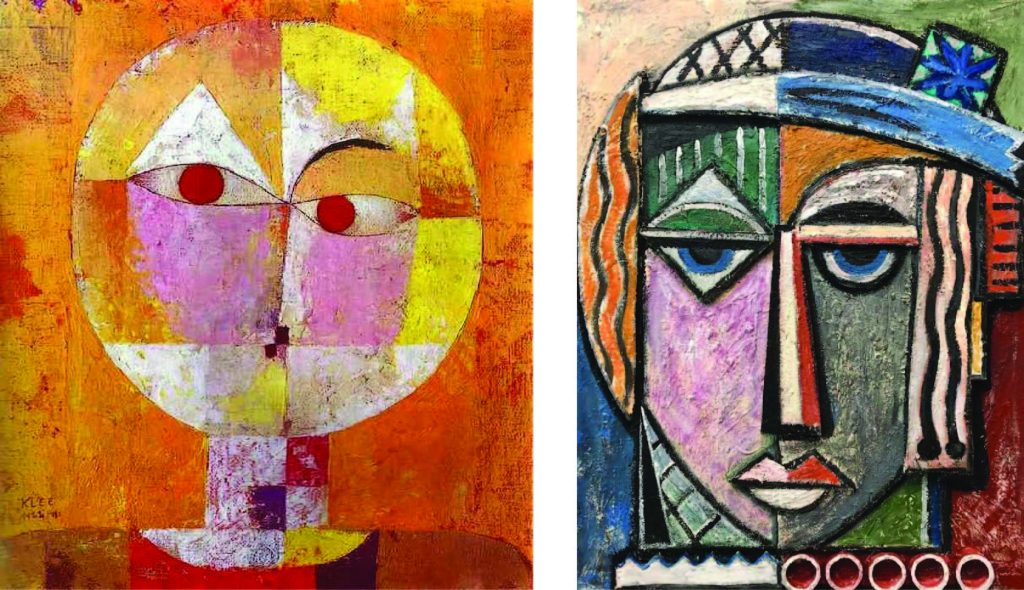
Paul Klee (Head of a Man) – Lorenzo Gonzalez Sancheze (Helena)
Portrait Two – Coloured
This portrait comes as a simplistic design with solid block colours and strong black outlines. However, despite it not being overly detailed or having shading/blending of colours, it conveys a beautifully artistic likeness to me. The key features of my face all have just enough uniqueness to them to make it very recognizable and eye catching. The contrast of the bright colours with the blue of the eyes, pink of the lips, and strong black lines of the glasses really stands out against the more faded skin and hair colours. Whilst the hair itself pops due to the bright highlight, working against those lower shadows to give it a bit of depth. It really feels like it has a nice balance and would work perfectly as my avatar next to a written piece, or something similar. The black background with stars is simple and is there to signify my love of the night.
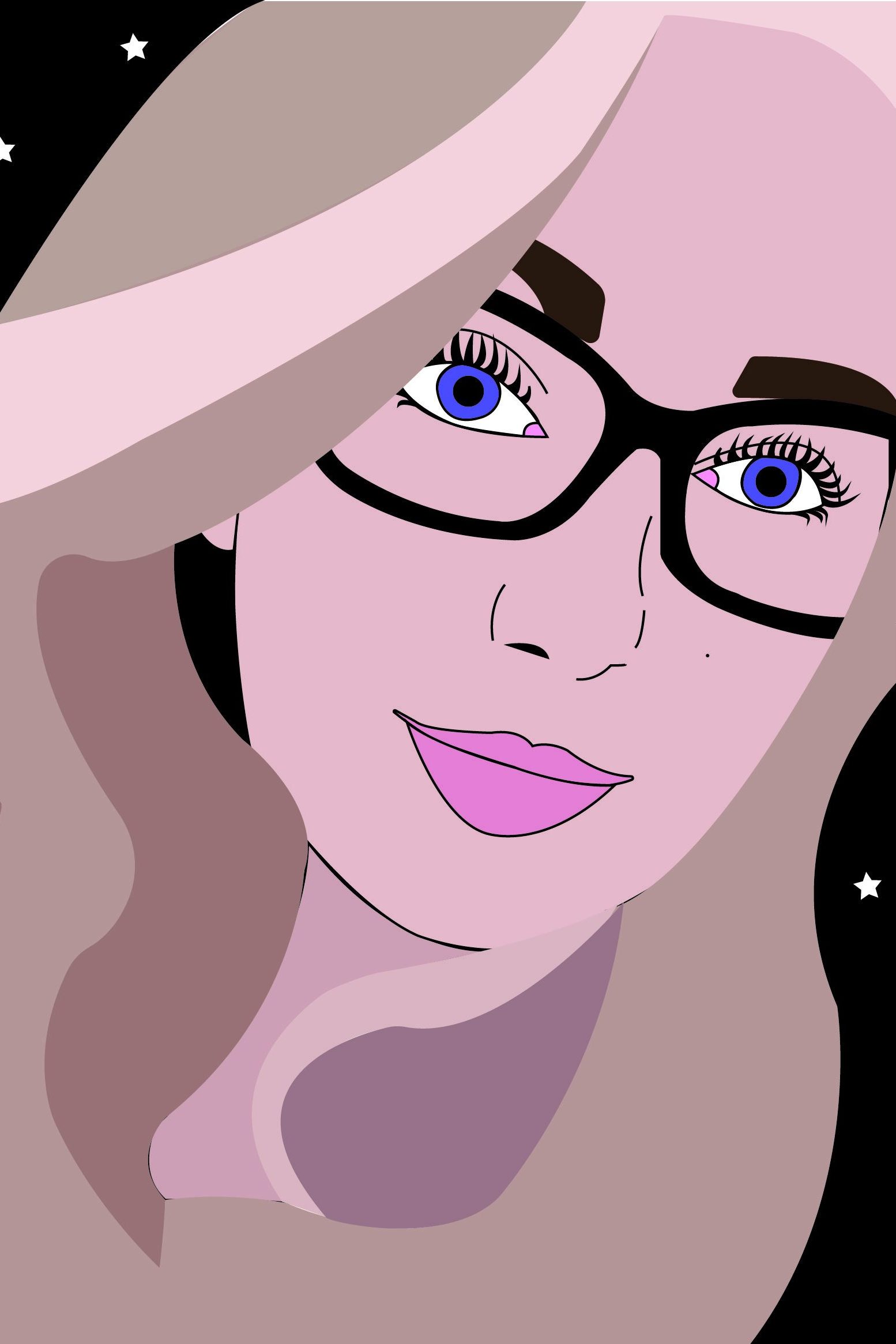
Illustrator Two – Coloured Portrait
Photoshop Portrait
Portrait One – Black & White
For this portrait I have used greyscale to create a black and white image, this is to give it a sketched effect like you would see in a manga. It was made by using the pen tool, and stroking the paths made, along with various selection tools, and a bit of brush work. An animation style can be seen with the large eyes, pointed chin and smaller facial features which is a popular anime style. I have gone with a gothic look for the eyes and lips, which works well with the black and white effect, this creates a bold and more eye-catching image. A background of books was added to fill in the blank space behind the portrait. This is also for my interest in book/manga, which is one of my biggest personal hobbies and major inspiration in me pursuing my career.
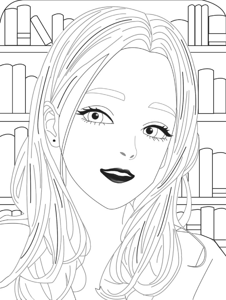
Photoshop Portrait One – Black & White Manga Inspired
Portrait Two – Coloured Animation
This portrait has a lot more detail than the others and is also an animation style. It is an evolution for the first Photoshop portrait, going from the black and white images you would see on a manga page to a full colour piece you would find either on the cover or an anime. This was made by using the pen tool, lots of selection work using the magic wand and other various tools. It has more intricate brush work mixed with blurring and smudging to create more realistic lips and irises. The bamboo in the background as well as the kimono clothes were chosen with a Japanese inspiration in mind. The extra detail added to this portrait gives it a more realistic aspect and pleasing result.
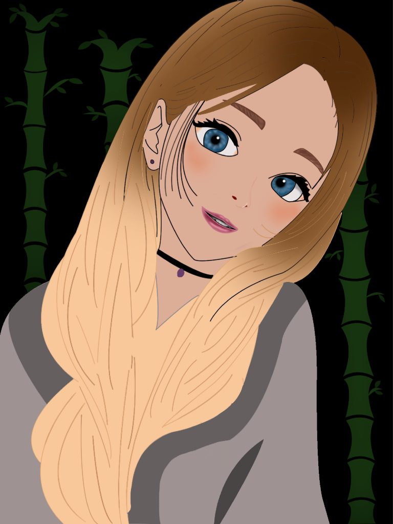
Photoshop Portrait Two – Coloured Animation Inspired
Self-Promotional Poster
Poster One – Jigsaw
As this is a Self-Promotional poster two ideas have been brought together to create a better understanding of my interests, as well as what type of Graphic Designer I hope to be in the future. the black and white Photoshop portrait was used and split into four sections. It was kept black and white to represent a manga style. The four sections are also used to represent this as manga templates are always split into sections. These sections have been made into a jigsaw puzzle; this is also a representation of my interest in challenges like you would find in a difficult puzzle. the lilac background gives a calming and feminine aesthetic, and the pink and purple Typographical logo works with the poster as the blend so well with the background colour, while still having enough difference to stand out. The bold Serif font for the “Graphic Design” is pleasing on the eye and easy to read with the black outline.
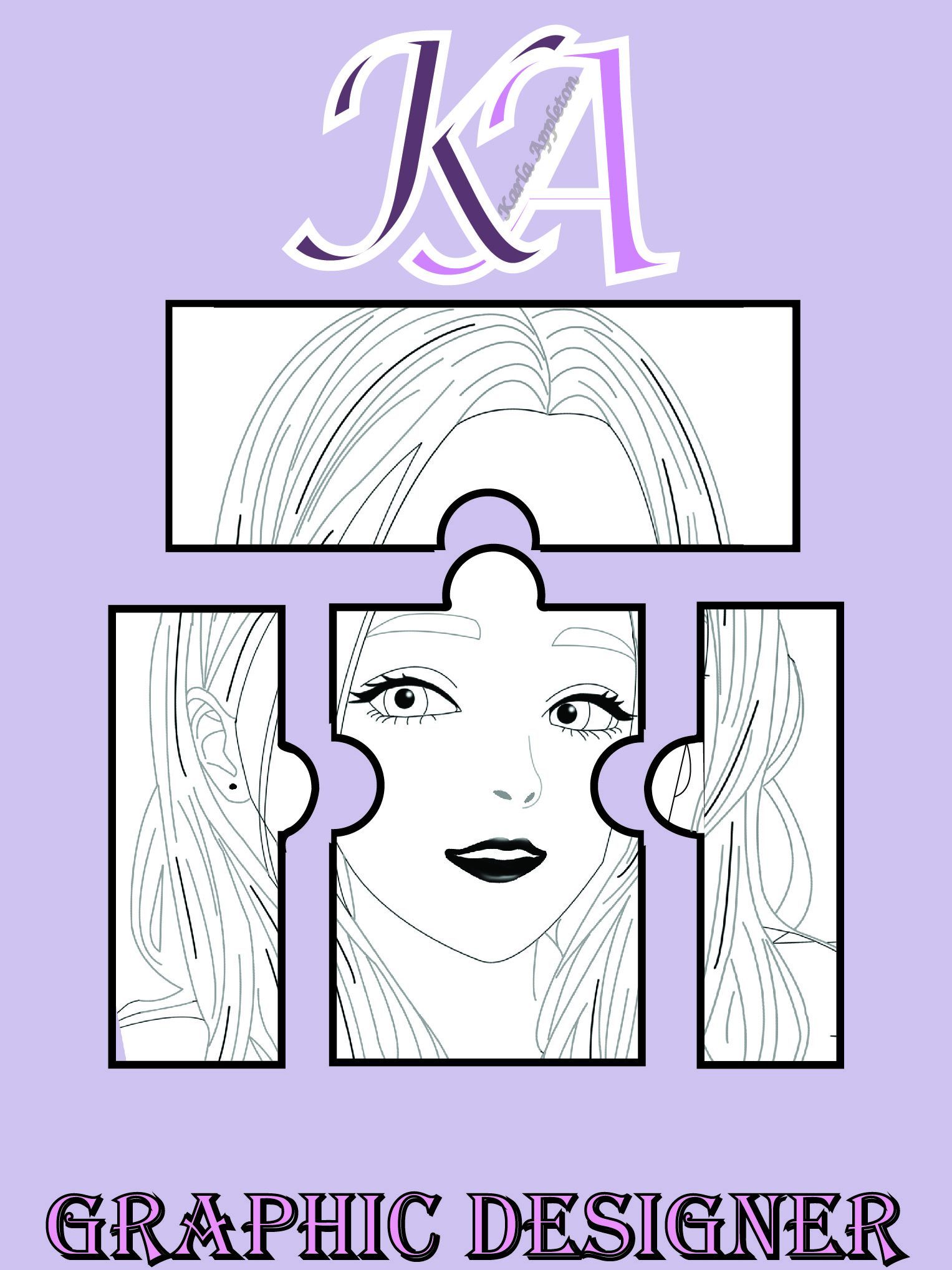
Self-Promotional Poster – Jigsaw & Manga Inspired
Poster Two – Lotus Candle
A Chinese and Japanese theme is used for this poster. This is represented by the use of a lotus flower, a well-known water plant in Asia. The conceptual candle personal logo has also been used to continue the spiritual essence that the lotus candle creates. Lotus candles are symbolic in Buddhism, symbolizing wisdom and spiritual purity but can also be used to symbolize mental health. The reason for the Chinese and Japanese theme is because of my interest in animation and manga as they are both incredibly popular in those countries. Throughout the poster I have chosen colours that are aesthetically pleasing and give off a warm feeling. the “Graphic Designer” has been made white and placed around the rising moon to look like beams, this also ties in with the moonlight reflection in the water. The white chosen for these continues from the logo and gives the best contrast to the candle flame and merges the divide between the text and image halves.
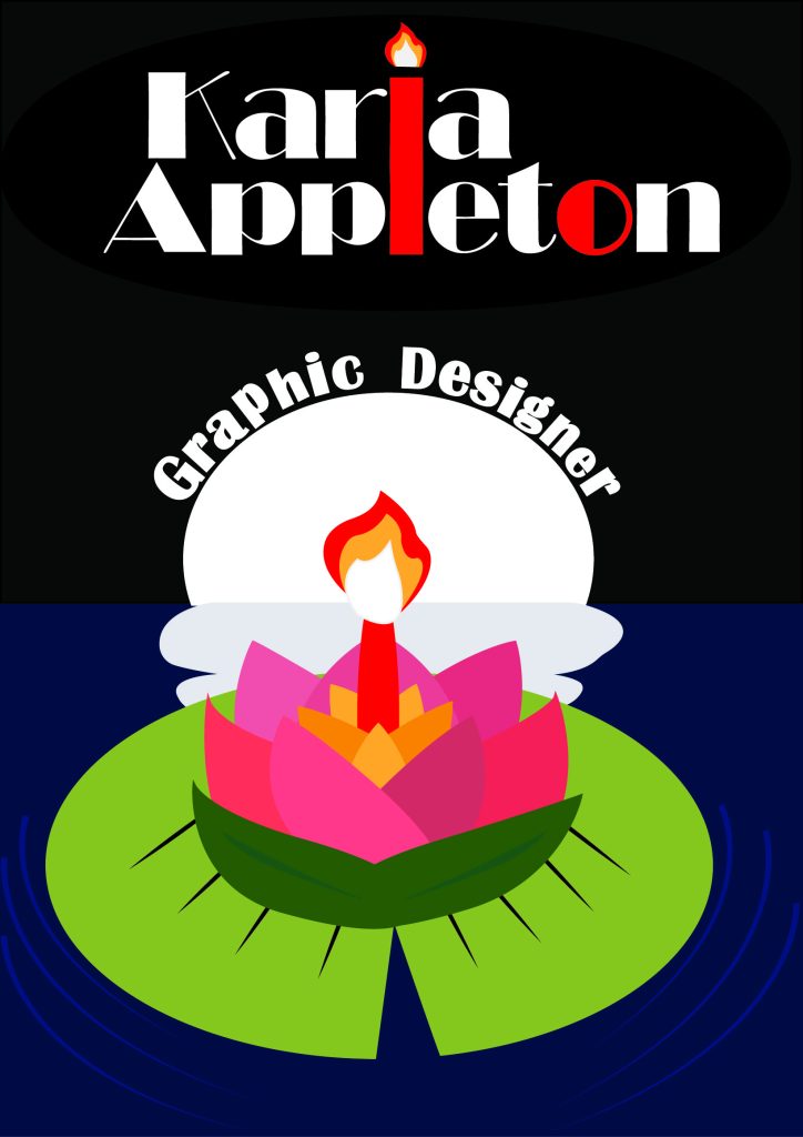
Self-Promotional Poster – Lotus Candle – Japanese & Chinese Inspiration
References –
Lorenzo Gonzalez Sanachez. (2021) Helena [Painting]. Available online: https://www.singular.com/en/artworks/lorenzo-gonz%C3%A1lez-s%C3%A1nchez-helena-1715975 [Accessed 07/12/23].
Paul Klee. (1922) Senecio (Head of a Man) [Oil on a canvas mounted on panel]. Kunstmuseum Basel, Switzerland.