Typographical Graphic Standards
Throughout the information pages for my rock festival programme, I have used a three-column grid system. This was chosen to keep the pages looking neat and organised rather than having information all over the place and confusing the readers. The sponsor and social media logos are all placed on the footer in each page, this consistency throughout makes them easy to spot, as well as not steal focus from the other information provided. Usually, the size and position of the sponsor logo would be negotiated in a real publication. This grid system was used on the first page to evenly space the logos, so they do not look overly crowded.
The main font used throughout each page is ‘SF Ironsides’. This was chosen as it is a much sharper font than others, which makes it have a more gothic/rock quality. It is also easy to read, which allows it to be used in a wide variety of information types.
For the colour theme, red, white, and black fonts have been chosen. Red and black are colours which you would usually associate with a rock theme. Red signifies blood and the devil. Black signifies death and the night. The colours chosen for the rock program pages are also to match the album covers, they are all tied together to create a consistency throughout each piece of work. The reason white was chosen is that it is often associated with black, as it is the opposite and brings a brilliant contrast with the darker colours. This is also very noticeable when looking at the white font which stands out from the background which allows for enough contrast to keep everything easily legible.
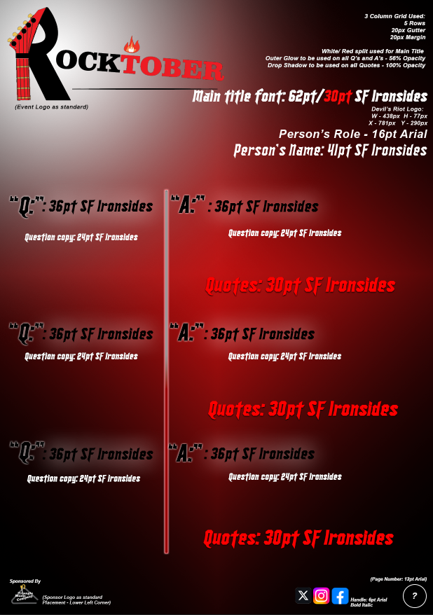
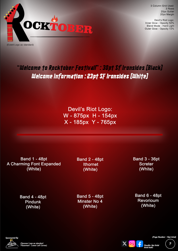
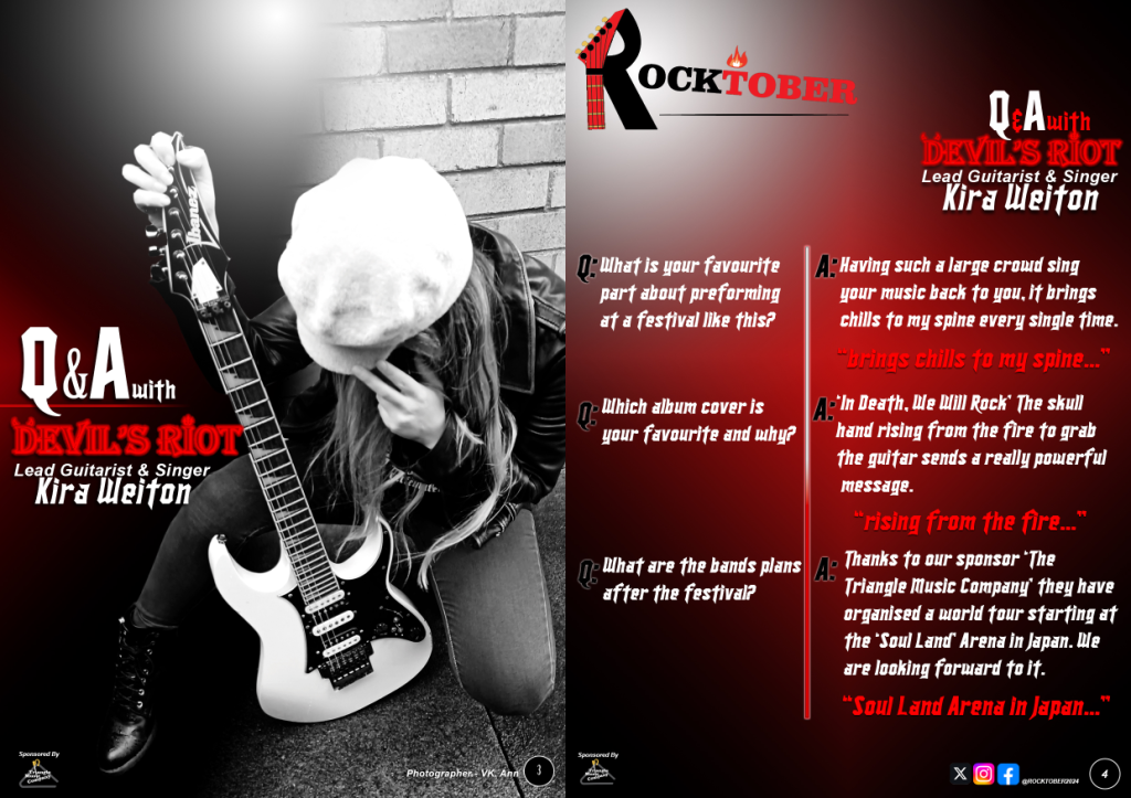
On page one the ‘Rocktober’ title and ‘Devil’s Riot’ are the largest on the page, this is because they are both important focal points and what I want the audience attention to focus on first, then secondly your attention shifts towards the bright white band names which are neatly placed in a three-column style so they are easy to read. Having such a large portion of the page also allows them to have plenty of space, even at this size, making sure they are easily recognisable. On page four for the ‘Q&A’ section, I have used the grid to give 2/3rds of space for answers while only 1/3rd for the questions. This is to allow the more important information and what the audience is interested in to have more space while keeping a good structure.
Throughout the three pages, there is a clear hierarchy on each page, as seen by the styles, colours and placement. An audience will most often focus on the largest or brightest aspect of a page first before directing their attention elsewhere. They also notice things more from top to bottom, and left to right, as they would with normal reading. This makes it easier to control the direction of the audience’s focus by making the more important aspects larger and gradually reducing in size.
Traditional or Online Conceptual Editorial Masthead (Logo) Design
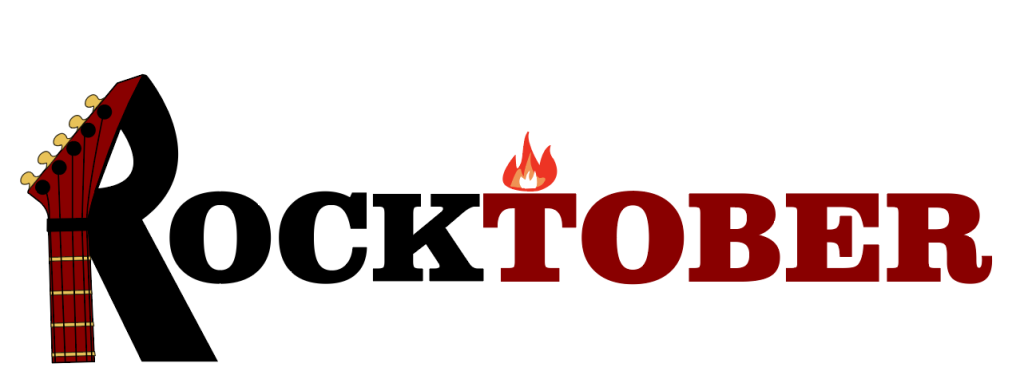
The ‘Rocktober’ and ‘Triangle Music Company’ have the same concept in their designs. They each use a piece of the musical instrument which either represents the name or the genre of music they are promoting as one or two of their letters. For the ‘Rocktober’ logo the guitar integrates into the ‘R’ letter which makes it look more striking, yet the shape of the letter is still obvious, so the reader can still understand what it is. Although the font used does not have any hard points like you see in most gothic themed fonts, the thick bold Serif style along with the fire, integration of the guitar and dark block colours chosen, still gives off a dramatic rock style. The colours chosen for this logo were with the program spreads in mind, as they have the same colour theme.
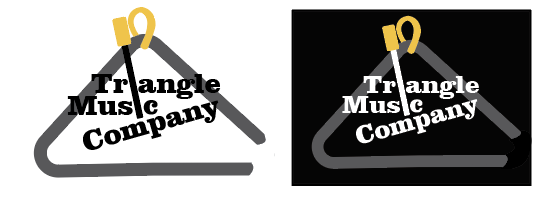
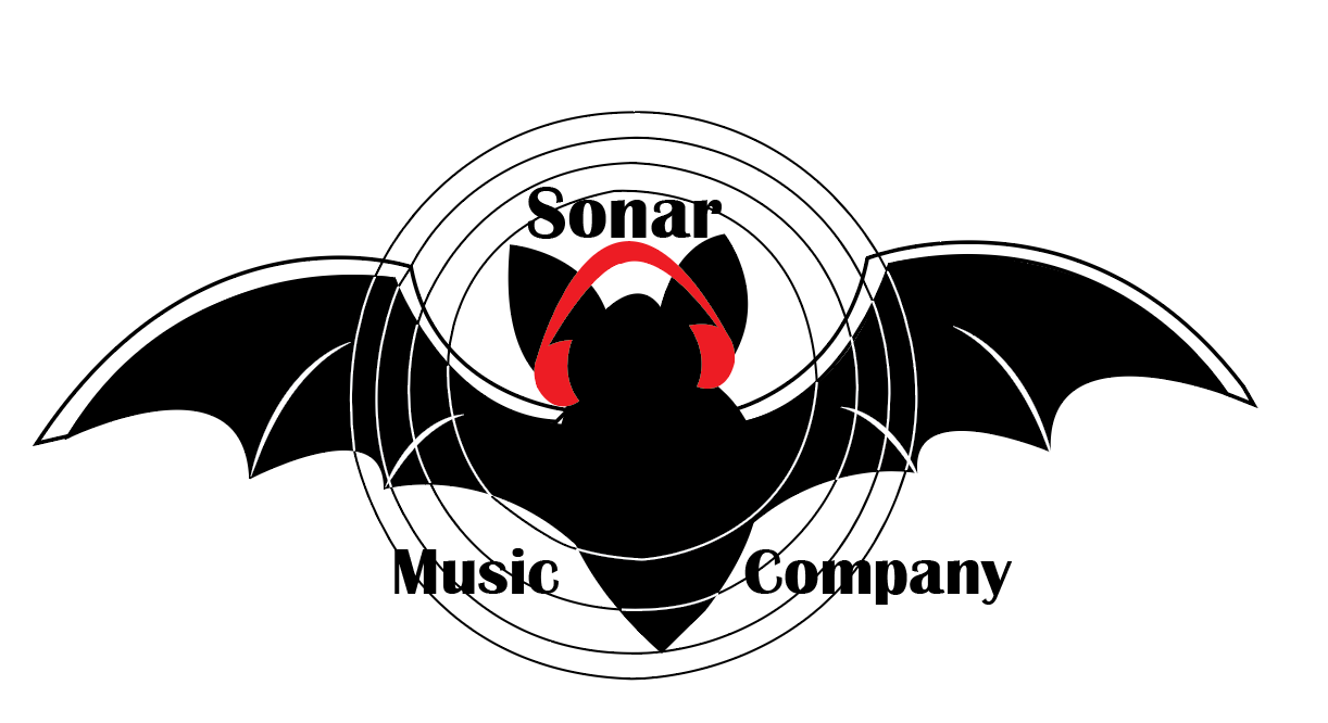
The logo used for the ‘Triangle Music Company’ is the second design chosen, as the first went wrong. Originally the music company was going to be called ‘Sonar Music Company’ which was represented by a logo of a bat, wearing headphones and sonar waves circled around. However, when using the stroke tool on illustrator it became apparent that when shrinking the logo down, the stroke became thicker, and it ended up ruining the logo image. After some editing, I managed to fix this problem, but I wanted to incorporate the headphones into the bat ears, yet the final result did not look right, so the idea was eventually scrapped.
The ‘Devil’s Riot’ is a simply designed logo, using the letter ‘I’ to represent the devil’s pitchfork and by putting the devil’s horns on top of the ‘D’. The colour red was chosen for the band title as well as the festival logo as it is a colour people usually associate with the devil. A light grey colour was chosen for the ‘Triangle Music Company’ logo, as it is a very subtle colour, depending on the background page the font changes from white to black so it can stand out more. This was due to the logo being smaller, so the idea of using a colour that would contrast with the background is to make it more noticeable.
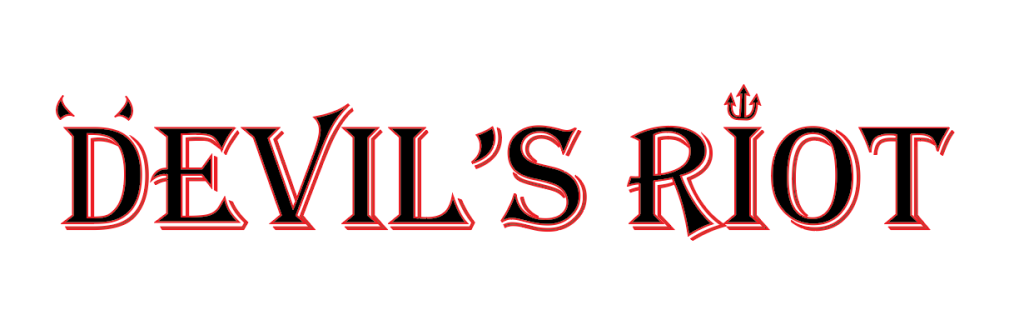
The music company logo is always placed in the lower left corner on both the program pages and album covers. This constant positioning makes it easier to find, but also takes up minimal space to allow room for the main content, and to make sure they do not overly draw the reader’s attention. The size and placement would usually have to be negotiated with sponsors in a real publication. For the Festival heading the ‘Rocktober’ is always positioned in the upper left corner, this is the same with the band name on the album covers, it is always to be positioned on either the upper left or central. This is one of the first things you see when you look at the program pages or album covers due to the strong block colours chosen, which makes them stand out more.
Four to Six Traditional or Online Editorial Information Pages
I have chosen to do a festival program for the four information pages. Targeting an audience between 20 – 40 years old who love rock music. The first attempt of this program was not used as it was far too simple and did not merge any of the images or texts together. The final version has a much more integrated style rather than the various elements on the page seeming isolated.
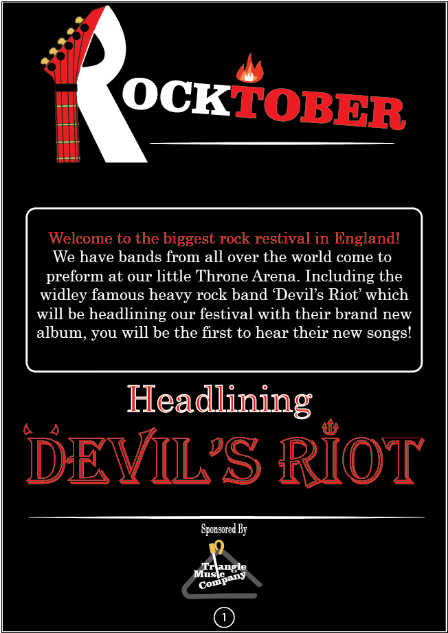
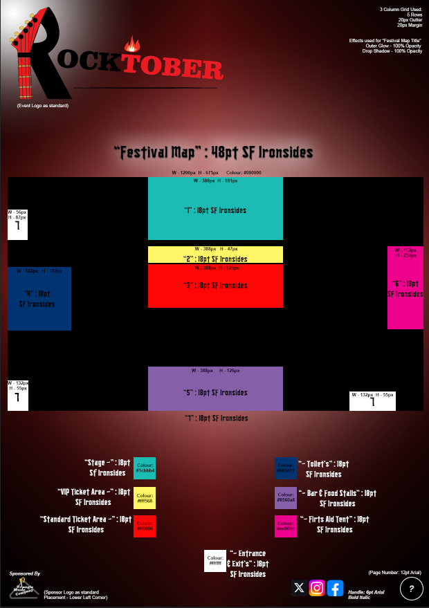
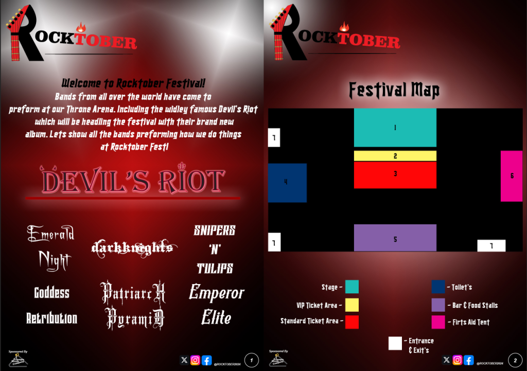
The colours were not only chosen to match with the ‘Rocktober’ festival title, but also to fit with the imagery you get when you think of ‘Devil’s Riot’ which is the main band the festival is promoting. Red is indicative of blood or the devil, black can symbolise the night, and white was chosen as it’s the opposite of black, which creates a vivid contrast and separates the dark colours. The background colours blend into each other to create a stage effect, rather than having plain block colours. The white gradient at the top is used as a spotlight effect, just like you would see on a festival stage. The first page is an information page to welcome the festival audience and to advertise the bands which will be preforming. The second page is a festival map, the design chosen is simple but with the audience in mind, as those who attend a festival usually end up drinking alcohol, this would make understanding a complex design difficult.
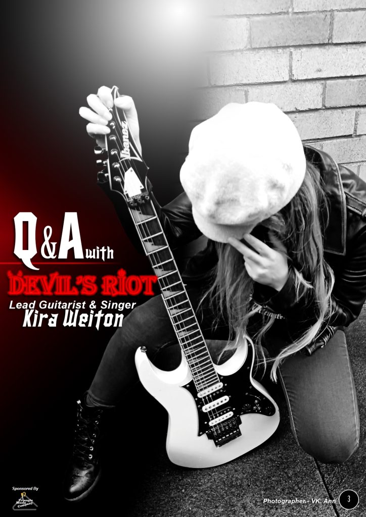
On page three, there is a black and white picture of me posing as the lead guitarist. Black and white is a stylistic choice to give the image a starker contrast, which makes it more eye-catching, this is obvious to see on the guitar as it is brighter and directs your focus to it. This page is to promote the information which is provided on the next page which is a question and answer page, and also advertise the band ‘Devil’s Riot’. This is also the purpose with the next page, reaching out to new and old fans.
The design process for these four pages could be considered simple, yet eye-catching and easy to understand. There is not an overload of information, the layout is neat, and easy to read, rather than too many different colours or information jumping out at you. This was decided with the audience in mind, as when you arrive at a festival and get given the program, you want something easy to understand so you can get the information you need and then enjoy the festival. Even the typography used throughout is the same on all pages, as it has a gothic and bold look as is easy to read, yet still fits in with the theme. This font was chosen to link the target audience and theme. On page one the different bands have their own unique logo fonts to make them easily recognisable. The size of each band logo has been made smaller than the ‘Devil’s Riot’ one as these are the secondary focus of the page. This is also what the spotlight is used for throughout the program, like an arrow shooting down on what area the designer wants your attention to focus on.
Three Cover Designs
Four these three album covers I tried to keep a consistent theme throughout the three designs. On every cover there is a satanic/rock element, such as the guitar with the devil’s pitchfork, the pumpkin with a green mohawk and fire in his eyes and the gravestone with the rock hand symbol on top.
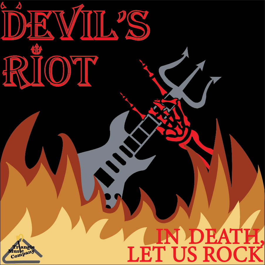
The colours chosen are similar throughout each album design. A black background was chosen so that the bright colours of each image stand out, as well as the blood red band title. The orange and yellow used for the fire in all three images contrasts with the dark background to create a more dramatic look. The colours were chosen with a satanic/rocker theme, so the use of red represents blood and the devil, as in the title. The grey is indicative of the grim reaper’s robes which is why it was chosen for the graveyard album cover, and the bright green on the pumpkin is a rocker style Mohawk. All colours were chosen to keep the same theme throughout each album cover.
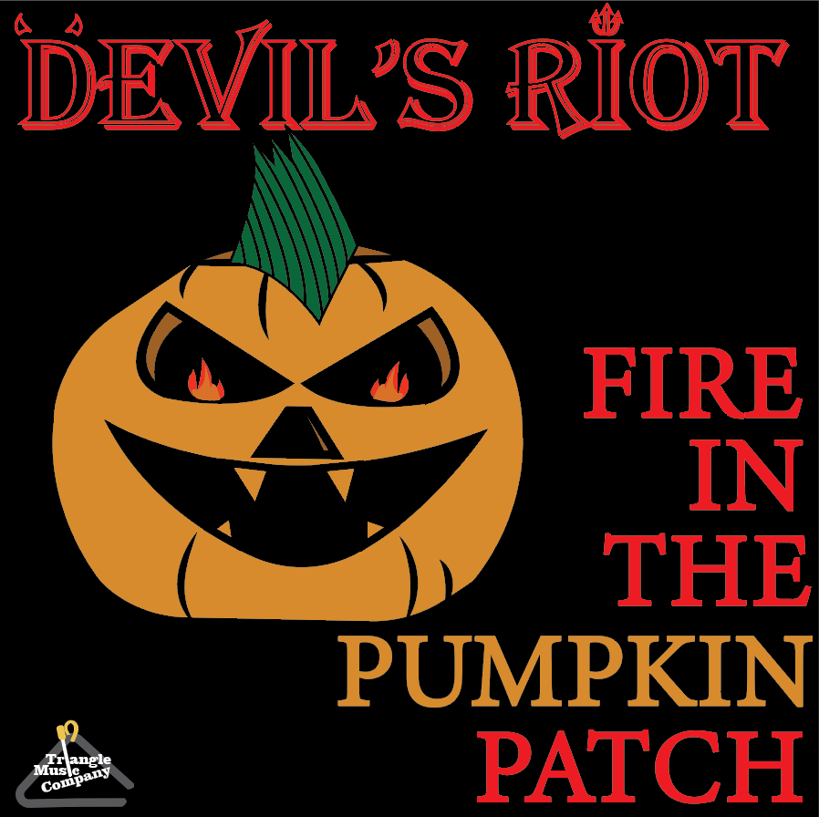
There are various conceptual designs throughout each cover. Starting with album one, the top of the electric guitar has been merged with the devil’s pitchfork, this is symbolic to both the band name and the genre of music the band represents. Then we have the skeleton reaching for the guitar, in which the hand has been made to display the rock hand symbol, which is widely used by fans of the rock genre to show their appreciation of the music. We see that symbol again on album three where it is used for the top of the grave headstone. For album two, the fire has been used for the pumpkin’s eyes, as well as the stem on top of the pumpkin has been transformed into a Mohawk hairstyle you would find on punk rockers.
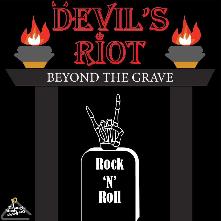
The layout for these covers is minimalist and not overcrowded, this is to direct your attention to the most important part, which is the band’s name. On the ‘Beyond The Grave’ cover, the fire in the oil lamps act as a beacon which draws your attention to the band name. For the ‘Fire In The Pumpkin Patch’ the bright green Mohawk grabs your attention first but acts as an arrow that points towards the title. It is like how the guitar and skeleton hand in the ‘In Death, Let Us Rock’ cover creates an ‘X’ shape with the fingers pointing towards the title, it is all to bring your focus to what the cover is promoting.
For the band’s name a Serif font was used which has an almost 3D quality to it, this was chosen as it gives off a carved from stone look, which you can find on gravestones, so it fits in with the theme. A Serif font is used for the song names on each album cover as it is a clean font which is easy to read.
